
You walk into your kitchen and something feels off. The cabinets are fine, the counters are okay, but the whole space just looks… flat. Here’s the thing: your backsplash is probably the culprit. It’s that forgotten strip of wall between your counters and cabinets, but when you get it right? Magic happens. Suddenly your whole kitchen feels intentional, pulled together, like you hired a designer. And the best part? A backsplash remodel is one of those rare projects that delivers massive visual impact without tearing your entire kitchen apart. You don’t need to replace cabinets or rip out countertops. Just that one wall change can make everything else look better. I’ve seen it transform kitchens from builder-grade boring to magazine-worthy in a weekend. Whether you’re craving classic subway tile with a twist, dreaming of bold patterns, or wondering if peel-and-stick is actually worth it — I’ve got you covered with 17 ideas that actually work in real homes. Let’s get into it.
Classic Subway Tile with Dark Grout
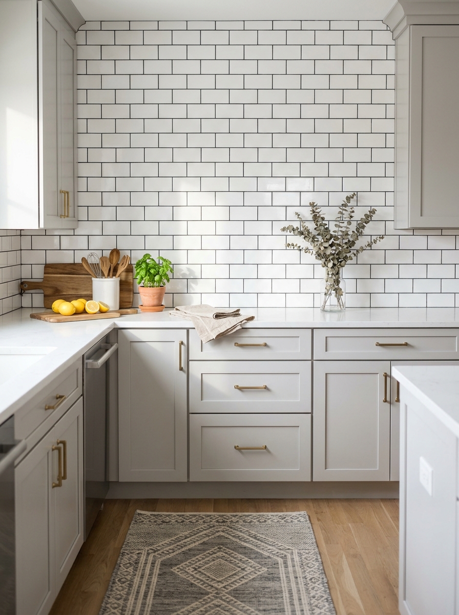
Subway tile will never go out of style, but here’s the upgrade that makes it feel current: dark grout. Instead of that standard white-on-white look that reads a bit sterile, charcoal or black grout lines add definition and character. The contrast creates a graphic quality that feels modern and intentional. I love how this combo hides everyday kitchen splashes too. Light grout shows every tomato sauce incident, but dark grout? It’s forgiving and practical. You get that crisp, clean subway tile aesthetic without the constant maintenance anxiety. The best part is how versatile this look is. It works beautifully with white cabinets for a classic feel, but it’s equally stunning against sage green or navy blue cabinetry. The dark grout acts like eyeliner for your kitchen — it just makes everything pop. And if you’re worried about it feeling too bold, remember that the grout lines are thin. They add impact without overwhelming the space.
Pro Tip: Use a grout sealer specifically rated for kitchen use and reapply it every 12-18 months to keep those dark lines looking crisp and prevent staining.
Handmade Zellige Tile in Sage Green
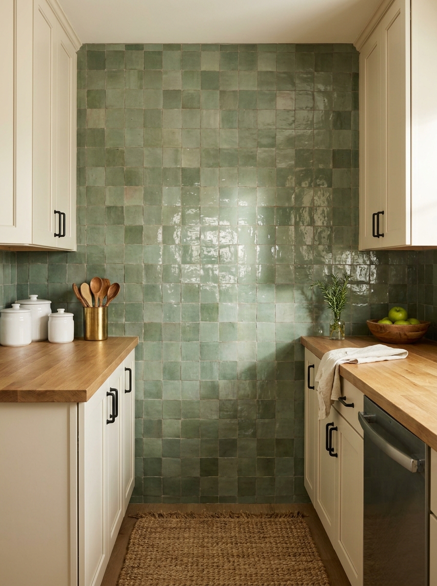
If you want your kitchen to feel like you traveled to Morocco and brought back the most beautiful souvenir, zellige tile is your answer. These handmade tiles have this gorgeous irregular surface that catches light differently throughout the day. No two tiles are exactly alike, and that’s the whole point. Sage green zellige has become incredibly popular, and I totally understand why. It brings in color without feeling too bold or trendy. The soft green reads as a neutral but adds so much more personality than white or gray. It’s calming and organic, like bringing a bit of nature indoors. The glossy finish is what really makes zellige special. It reflects light beautifully, making even small kitchens feel brighter and more spacious. And because each tile has slight variations in color and texture, your backsplash becomes this subtle, shifting piece of art. Fair warning though — zellige is an investment. But if you’re planning to stay in your home for a while, it’s the kind of detail that makes your kitchen feel truly custom and considered.
Pro Tip: Order 15-20% extra tiles beyond what you need for the installation, as zellige tiles vary significantly between batches and you’ll want matching pieces for future repairs.
Navy Blue Geometric Patterned Tile
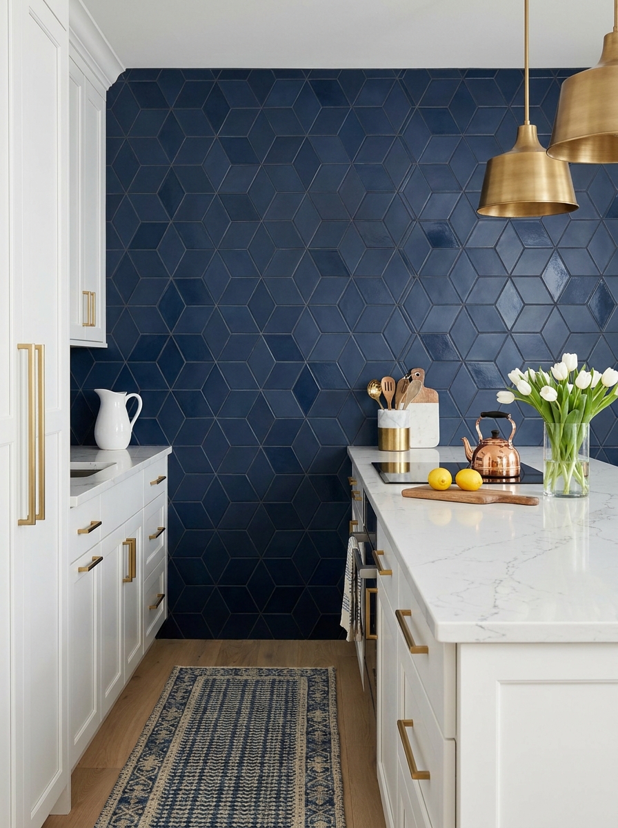
Sometimes you need to just go for it, and a bold geometric tile in navy blue is that moment. This isn’t a timid choice, but if you’re craving personality and visual interest, patterned tile delivers in a major way. The geometric shapes create movement and energy that makes your kitchen feel intentionally designed. Navy is surprisingly versatile as a backsplash color. It pairs beautifully with white cabinets for a classic nautical vibe, but it’s also stunning with warm wood tones or even brass and gold accents. The deep blue acts as a rich neutral that grounds your space while still making a statement. One thing I love about geometric patterns is how they draw the eye upward and create visual height. If you have a smaller kitchen, a patterned backsplash can actually make the space feel more dynamic and interesting rather than cramped. Just keep the rest of your kitchen relatively simple — let the backsplash be the star. This is where you want your counters styled minimally and your cabinet fronts clean and uncluttered.
Pro Tip: Install patterned tile only on the main backsplash wall and use a coordinating solid tile (like plain navy or white) on side walls to prevent visual overwhelm.
Warm Terracotta Handmade Tile

There’s something so grounding about terracotta in a kitchen. These warm, earthy tiles bring an instant dose of Mediterranean charm and make your space feel like a sun-soaked Italian villa. Handmade terracotta tiles have this beautiful irregular quality — slightly uneven surfaces and color variations that add character and soul. The warm orange-pink tones work magic with natural wood elements and create the coziest atmosphere. If your kitchen gets good natural light, terracotta practically glows in the afternoon sun. And if your space is on the darker side, these tiles add warmth that makes the room feel inviting rather than cave-like. What I especially love is how terracotta ages beautifully. Unlike some materials that show wear in unflattering ways, terracotta develops a lovely patina over time. It’s a living material that gets better with age. Pair it with ivory or cream cabinets, black matte fixtures, and plenty of natural wood tones. Add some trailing pothos or herbs in terracotta pots and you’ve got yourself an absolute kitchen mood.
Pro Tip: Seal terracotta tile with a penetrating sealer designed for porous materials, and wipe up acidic spills (tomato sauce, wine, lemon juice) immediately to prevent staining.
Natural Stone Slab in Honed Marble

Forget individual tiles — a full marble slab backsplash is the ultimate luxury move. I’m talking about one continuous piece of honed marble that runs from counter to cabinet, no grout lines to interrupt that gorgeous veining. It’s dramatic, it’s sophisticated, and honestly? It makes your kitchen look like it belongs in a design magazine. Honed marble (that’s the matte finish, not shiny) feels so much more modern and forgiving than polished. You won’t see every fingerprint or water spot, which is huge in a working kitchen. The natural veining becomes actual artwork on your wall — every slab is completely unique. I love pairing it with warm brass fixtures and light wood cabinets to keep it from feeling too cold or formal. Yes, marble needs some care, but if you seal it properly and wipe up acidic spills quickly, it’s totally doable. The payoff? A backsplash that feels custom and high-end without trying too hard. It’s that effortless elegance we’re all chasing.
Pro Tip: Ask your stone supplier to show you the full slab before cutting so you can choose exactly which section of veining goes on your wall — placement makes all the difference in the final look.
Metallic Penny Round Tile in Brushed Copper

If you want your backsplash to literally shimmer and catch the light all day long, penny rounds in metallic finish are your answer. These small circular tiles create the most incredible texture and movement — they’re playful without being cutesy, and that brushed copper finish adds instant warmth to any kitchen. What I love about penny rounds is how they catch light differently throughout the day. Morning sun? They glow. Evening pendant lights? Total magic. The individual circles create this subtle 3D effect that flat tiles just can’t match. And copper tones work with everything — white cabinets, dark wood, even bold colors. It’s that secret ingredient that makes the whole space feel more expensive and thoughtful. Don’t worry about them reading too busy. The repetitive circular pattern actually creates a soothing rhythm, and the metallic finish reflects light around your kitchen, making the space feel bigger and brighter. Pair them with matte black fixtures for contrast, or go full warm-toned with brass and wood.
Pro Tip: Install penny rounds on a mesh backing sheet — it keeps all those tiny circles perfectly aligned and cuts your installation time in half compared to placing individual tiles.
Large Format Concrete-Look Porcelain

Large format tiles in concrete-look porcelain are having a serious moment, and I’m completely here for it. We’re talking 12×24 inch (or bigger!) tiles that give you that industrial-chic concrete vibe without the maintenance nightmare of actual concrete. It’s modern, it’s minimal, and it makes your kitchen feel like a cool Brooklyn loft. The beauty is in the subtlety — these tiles have slight color variations and texture that mimic real poured concrete, but they’re completely sealed and easy to clean. With fewer grout lines, your backsplash reads as one smooth surface, which visually expands your space. I especially love the soft gray tones that work as a perfect neutral backdrop, letting your dishes, plants, and cooking tools become the color story. This look pairs beautifully with stainless steel appliances, matte black fixtures, and either all-white cabinets for high contrast or warm wood for a softer feel. It’s that effortlessly cool aesthetic that doesn’t scream for attention but somehow makes everything else look better.
Pro Tip: Use rectified tiles (perfectly squared edges) and minimal grout lines in a matching gray tone to maximize that seamless concrete slab effect — it’ll look custom and architectural.
Glossy White Beveled Subway with Contrasting Grout

Sometimes the classics just can’t be beat — but we’re giving traditional subway tile a fresh update with beveled edges and unexpected grout color. That beveled edge catches light and creates subtle shadows that add so much dimension. It’s subway tile, but make it interesting. The real game-changer here is your grout choice. Instead of standard white, try charcoal gray or even black for serious definition and visual pop. Suddenly those familiar subway tiles look graphic and intentional instead of builder-grade basic. The glossy finish is key too — it reflects light beautifully and is incredibly easy to wipe down (hello, cooking splatters). This combination works in literally any kitchen style, from farmhouse to ultra-modern. I love how timeless this feels. You won’t look at it in five years and think “ugh, so dated.” But the beveled edge and contrasting grout keep it from feeling boring or expected. Pair it with marble counters and brass fixtures for warmth, or go full modern with white quartz and matte black hardware.
Pro Tip: Run your subway tiles vertically instead of the traditional horizontal brick pattern — it draws the eye up, makes ceilings feel higher, and gives classic tile a completely fresh perspective.
Vertical Stacked Ledger Stone in Mixed Gray Tones

If you want texture that makes people stop and stare, ledger stone is your answer. These stacked panels create incredible dimension — actual depth you can feel with your fingers. I’m obsessed with how the mixed gray tones catch light differently throughout the day. The vertical installation draws your eye upward and makes standard 8-foot ceilings feel taller. Each stone piece has natural variation, so no two installations look exactly alike. It’s rugged without feeling rustic, modern without being cold. This works beautifully behind a range where you want a focal point that can handle heat and splatter. The textured surface hides imperfections way better than flat tile, which is genius if you’re not a perfect grouter. Pair it with sleek white cabinets and the contrast is absolutely stunning.
Pro Tip: Seal natural stone ledger panels with a penetrating sealer before installation — it makes cleanup SO much easier and prevents oil stains from settling into those gorgeous crevices.
Black Hexagon Tile with White Grout Grid

Bold black hexagons with crisp white grout lines create a graphic punch that’s impossible to ignore. This look is modern farmhouse meets Parisian bistro, and I’m completely here for it. The honeycomb pattern adds visual interest without feeling busy. What I love most is how versatile black actually is. It anchors a space, hides splatter marks like a dream, and makes white cabinets look even brighter by comparison. The white grout grid keeps it from feeling too dark or heavy. This pattern works in kitchens of any size. In a small kitchen, it adds personality without overwhelming. In a large kitchen, it creates a stunning focal wall behind the stove. The matte finish is my favorite — it’s sophisticated and doesn’t show fingerprints or water spots the way glossy tile does.
Pro Tip: Use a grout sealer specifically designed for white grout on dark tile — it prevents the white lines from absorbing stains and keeps that crisp contrast looking fresh for years.
Mirrored Antiqued Glass Tile in Smoky Bronze

Mirrored tile sounds fancy, but hear me out — it’s a total game-changer for small or dark kitchens. Antiqued glass in smoky bronze reflects light without being shiny or obvious. It adds depth and makes your space feel twice as big. The antiqued finish is key here. It’s not a perfect mirror — it has a soft, aged patina that feels collected rather than builder-grade. The bronze tone brings warmth and pairs beautifully with both gold and black hardware. I installed this in a galley kitchen with limited natural light, and the difference was immediate. The backsplash bounces light around the room and creates this beautiful glow in the evening. It’s glamorous without trying too hard, which is exactly my design sweet spot.
Pro Tip: Install mirrored tile on a perfectly smooth wall surface — any bumps or imperfections will show through the reflective surface, so proper wall prep is absolutely essential here.
Reclaimed Wood Plank Wall in Weathered White Oak

Who says backsplashes have to be tile? Reclaimed wood planks sealed for kitchen use create warmth that tile just can’t match. I’m talking about weathered white oak with beautiful grain patterns and natural character marks that tell a story. This works especially well in modern farmhouse or Scandinavian-style kitchens where you want organic texture. The horizontal planks add width to narrow kitchens, and the pale wood tone keeps things feeling light and airy rather than cabin-dark. You’ll need proper sealing to protect against moisture and splatter, but once that’s done, it’s surprisingly low-maintenance. The wood develops a beautiful patina over time. Pair it with matte black fixtures and white counters for a look that feels collected and timeless rather than trendy.
Pro Tip: Apply multiple coats of marine-grade polyurethane sealer to wood backsplashes near the sink and stove — this creates a waterproof barrier that stands up to daily kitchen moisture and heat.
Iridescent Fish Scale Tile in Soft Aqua

Fish scale tile — also called scallop or mermaid tile — adds the most gorgeous movement to a kitchen. I’m obsessed with how the curved edges catch light differently throughout the day. In soft aqua or seafoam, it feels fresh without being too beachy or themed. The overlapping pattern creates this beautiful ripple effect that makes your backsplash feel almost three-dimensional. I love pairing it with white quartz counters and light wood cabinets to keep things airy. The iridescent glaze is key here — it shifts from pale blue to silvery green depending on the angle, which makes your kitchen feel alive and interesting even on cloudy days. This style works beautifully in coastal homes, obviously, but I’ve also seen it look stunning in modern city kitchens where you want a touch of organic softness. The curved shape feels feminine and elegant without being fussy. It’s one of those backsplashes that makes guests stop and stare — in the best way possible.
Pro Tip: Install fish scale tiles in a vertical orientation rather than the traditional horizontal layout to make your ceilings feel taller and create a more dramatic waterfall effect.
Patterned Cement Tile in Black and White Encaustic Design

Cement tiles are having such a moment right now, and I totally understand why. These handmade beauties bring instant pattern and personality without feeling too trendy or temporary. The black and white encaustic designs — think Moroccan or Spanish-inspired geometrics — create a stunning focal point that works with almost any cabinet color. What I love most is how cement tiles age. They develop this soft patina over time that makes them feel even more special and authentic. The matte finish is practical too — no fingerprints or water spots showing up constantly like on glossy tile. Each tile is slightly different because they’re handmade, which adds to that artisan, collected-over-time vibe. These tiles do need sealing and a bit more maintenance than porcelain, but the visual impact is absolutely worth it. They make a builder-grade kitchen feel custom and expensive instantly. Pair them with simple white cabinets and butcher block counters for a modern farmhouse look, or go bold with dark cabinets for serious drama.
Pro Tip: Use patterned cement tile only on the backsplash area between counters and cabinets, then switch to solid white or neutral tile behind the stove to avoid visual overwhelm while keeping the pattern as a statement feature.
Stainless Steel Sheet Backsplash with Brushed Finish

Okay, hear me out on this one — stainless steel isn’t just for restaurant kitchens anymore. A brushed stainless sheet backsplash brings this sleek, industrial-chic vibe that’s incredibly practical and surprisingly beautiful. It reflects light without being mirror-shiny, making small kitchens feel more spacious and bright. The beauty of a steel sheet is the seamless look. No grout lines to clean, no tiles to crack or chip. Just one smooth, continuous surface that wipes down in seconds. I love how it plays off modern appliances and creates this cohesive, professional feel. The brushed finish hides fingerprints and water spots way better than polished steel, which is crucial for a hardworking backsplash. This works beautifully in ultra-modern kitchens with concrete counters or white quartz. Add warm wood elements and greenery to soften the industrial edge. It’s bold, yes, but in a sophisticated way that feels intentional and design-forward. Plus, it’s incredibly durable — this backsplash will literally outlast your cabinets.
Pro Tip: Have your stainless steel sheet custom-cut to fit your exact backsplash dimensions and install it with hidden mounting clips rather than visible screws for a truly seamless, high-end appearance.
Colorful Moroccan Zellige in Mixed Jewel Tones
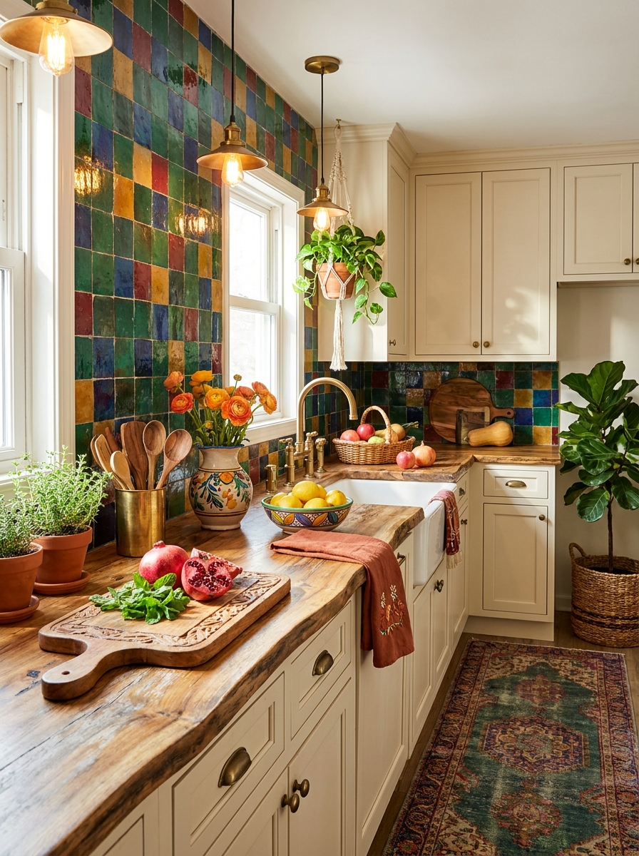
If you want your kitchen to feel like a work of art, multi-colored Moroccan zellige is your answer. These handmade tiles come in the most incredible jewel tones — emerald, sapphire, ruby, topaz — all mixed together in a way that somehow works perfectly. The irregular surface and color variations make each tile completely unique. What makes this backsplash so special is the depth of color. Zellige tiles are glazed by hand, so you get these beautiful variations within each piece — some darker, some lighter, some with little imperfections that add character. When you mix multiple colors, the effect is stunning without being chaotic. The tiles almost shimmer in natural light. This is definitely a bold choice, but it’s also timeless in a way that trendy patterns aren’t. Moroccan tile has been gorgeous for centuries and will continue to be. I love pairing jewel-tone zellige with warm brass fixtures and natural wood to let those colors really sing. Keep everything else simple so your backsplash can be the star it deserves to be.
Pro Tip: Order extra tiles in your favorite colors from the mix and use them to create a gradient effect, transitioning from darker jewel tones at the bottom to lighter shades toward the top for added visual interest.
Elongated Picket Tile in Matte Charcoal

Picket tiles are having a major moment, and I’m completely obsessed with how they bring vertical drama to a kitchen. These slim, elongated tiles look like tiny fence pickets standing upright — they’re longer and narrower than subway tiles, which creates this beautiful stacked rhythm that draws your eye up and makes your ceiling feel miles higher. I love using them in matte charcoal because the soft, non-reflective finish feels sophisticated without being too moody. The vertical installation creates subtle shadow lines throughout the day that add dimension you just don’t get with flat tiles. It’s modern but not cold, graphic but still warm enough for a kitchen where you actually cook and gather. The beauty here is in the repetition. Those clean vertical lines create a sense of order and calm that makes even a small kitchen feel more intentional and designed. Pair them with light countertops and warm wood tones to keep things balanced, or go bold with dark cabinets for a moody, gallery-like vibe.
Pro Tip: Install picket tiles with a tight grout line (1/16 inch) in a matching charcoal color to emphasize the vertical lines and create a seamless, almost fabric-like texture that feels cohesive and intentional.
Your Kitchen’s About to Get Its Moment
Here’s what I know for sure: your backsplash isn’t just a protective strip of tile. It’s the jewelry of your kitchen, the detail that pulls everything together and makes people ask “who did your renovation?” even if you only changed that one wall. Whether you go classic with subway tile, bold with geometric patterns, or organic with handmade zellige or terracotta, you’re creating a focal point that transforms the entire feel of your space. And that’s the beautiful thing about backsplash projects — they’re doable. You don’t need to gut your kitchen or take out a second mortgage. Just that one intentional change can make everything else look more expensive and considered. So pick the style that makes your heart skip a little, order those samples, and get ready to fall back in love with your kitchen. Trust me, three months from now you’ll wonder why you waited so long. Your morning coffee is about to taste better in a kitchen that finally feels like you.
Frequently Asked Questions
How much does it cost to install a new kitchen backsplash?
For a standard 30 square foot backsplash, expect to spend $300-900 for basic subway tile including materials and installation, or $1,200-2,500 for premium options like zellige or custom geometric patterns. DIY installation can cut costs by 40-50% if you’re comfortable with tile work. Don’t forget to budget an extra 10-15% for materials waste and potential repairs.
Can I install backsplash tile over existing tile?
Yes, you can tile over existing tile if the current surface is firmly attached, flat, and in good condition. Clean it thoroughly, lightly sand the glaze to help adhesion, and use a high-quality thin-set mortar. However, this adds thickness which may affect outlets and cabinet fit, so sometimes removal is the better long-term solution.
What’s the easiest backsplash tile to install for beginners?
Large format subway tiles (like 4×12 instead of 3×6) are the most beginner-friendly because you have fewer cuts and less grout work. Peel-and-stick tile is even easier but won’t last as long. Avoid tiny mosaics, intricate patterns, or natural stone for your first project — save those for when you’ve got a few installations under your belt.
How do I choose a backsplash color that won’t look dated?
Stick with colors that appear in nature — whites, soft greens, warm terracottas, deep blues, and natural stone tones age beautifully. These hues have been used in homes for centuries and won’t feel trendy in five years. Avoid colors that are having a specific “moment” on social media unless you’re prepared to update again in a few years.
Should my backsplash match my countertops or cabinets?
Your backsplash should complement rather than match exactly. If you have white cabinets and white counters, a colorful or textured backsplash adds necessary visual interest. If your counters have busy patterns, choose a simpler backsplash. Think of it as the bridge between your cabinets and counters, tying them together without competing for attention.