
You know that moment when the fireplace should be the star, but somehow the wall around it still feels a little… unfinished? Maybe the hearth looks fine, but the TV is awkward, the mantel is trying its best, and the whole setup doesn’t quite have that pulled-together Pinterest magic you saved at midnight. I’ve been there. A fireplace wall can do so much more than hold a firebox and a candle or two. The good news is, you don’t need a showroom budget or a custom designer team to make it feel intentional. Sometimes it’s the material that climbs higher. Sometimes it’s the shelving, the paint color, the art, or the way the whole wall connects to the rest of the room. That’s where the real transformation happens. These ideas are about making the fireplace wall feel like a full design feature, not just a practical spot with heat. Think beautiful, livable, and actually doable. Here’s what actually works.
Wrap the Entire Wall in Limewash or Plaster
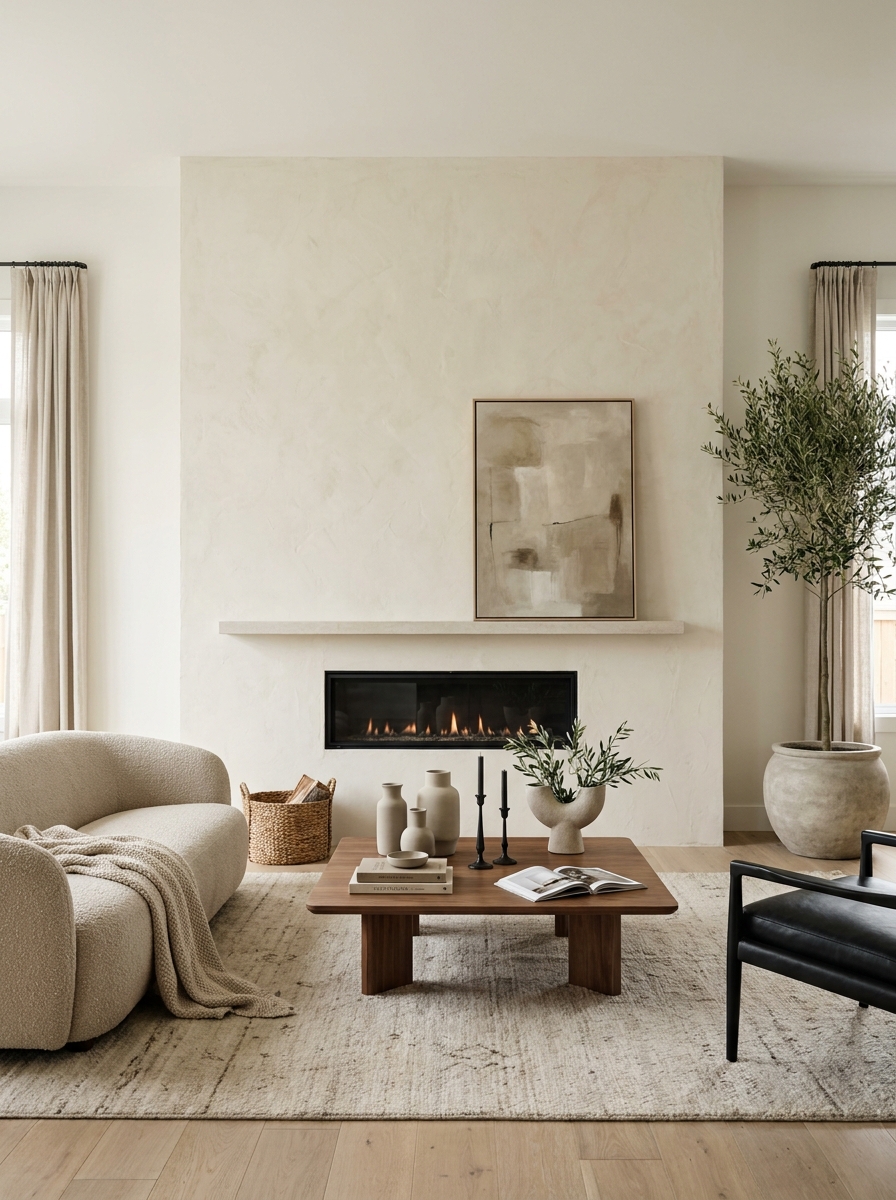
If your fireplace wall feels choppy, this is such a good fix. Covering the whole wall in plaster or a soft limewash finish instantly makes everything feel calmer and more expensive, even if the room itself is pretty simple. It blurs the line between fireplace surround and regular wall, which is exactly why it works. Instead of one little focal point floating in space, you get a full architectural moment. I especially love this in living rooms that already lean warm and quiet. A cloudy plaster finish in pale greige or creamy stone catches light in the prettiest way, and it plays so nicely with wood, linen, and black accents. And no, it doesn’t have to feel stark or overly minimal. Add a chunky chair, a textured rug, and a stack of books nearby, and suddenly the wall feels soft instead of severe. The best part? It doesn’t need a fussy mantel to feel complete. The texture becomes the decoration. That’s the magic here. It’s subtle, but it changes everything when you walk into the room.
Pro Tip: Test your plaster or limewash sample in both daylight and lamplight before committing, because the color shift can be bigger than you think.
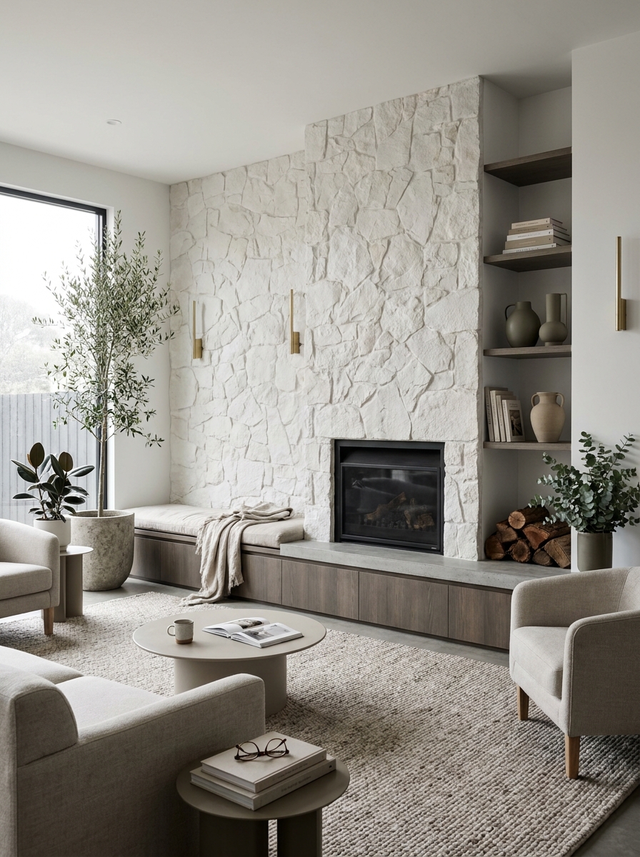
Add Built-In Shelves That Stretch to the Ceiling
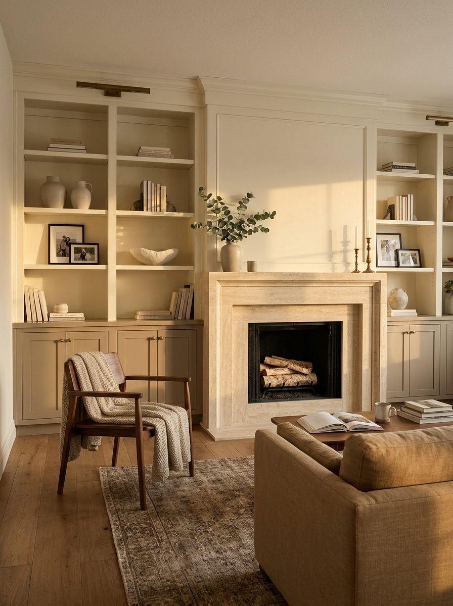
A fireplace wall gets so much stronger when it has something framing it. Ceiling-height built-ins do that beautifully. They make the fireplace feel rooted, balanced, and part of the architecture instead of a lonely feature stuck in the middle of drywall. Plus, they give you a place for all the pretty things and the practical things. Dream combo. This works especially well in family rooms where you need storage but still want the space to feel polished. Closed cabinets at the bottom hide games, chargers, and the random stuff that multiplies in every living room. Open shelves above let you style books, ceramics, framed photos, and a little greenery without cluttering every surface in the room. It’s structured, but it still feels personal. And here’s the key. Don’t stuff every shelf. Let some sections breathe. A fireplace wall with built-ins should feel collected, not like a home goods aisle exploded. Keep the styling loose and layered, with different heights and a few empty pockets. That negative space is what makes the whole thing feel elevated.
Pro Tip: Use cabinet-depth lower built-ins and shallower upper shelves so the wall feels lighter and less bulky.
Run Stone Slabs Floor to Ceiling for Drama
Want that wow moment without adding a bunch of decor? Go vertical with stone. A floor-to-ceiling stone fireplace wall feels grounded and dramatic in the best way, and it turns even a basic living room into something that looks deeply considered. One material. Big impact. That’s my favorite kind of design decision. This is especially gorgeous if you like a cleaner look and don’t want lots of styling fuss. Large-format stone or stone-look slabs create those long uninterrupted lines that make ceilings feel taller and the room feel more architectural. Think soft veining, warm beige tones, maybe a little charcoal if you want more contrast. Then let the furniture stay simple. The wall is already doing a lot. I also love how stone adds depth without needing bright color. It brings movement, shadow, and natural variation, which keeps the room from feeling flat. And if you’re worried it might feel cold, that’s fixable. Layer in walnut, boucle, aged brass, and a good rug underfoot. Suddenly the whole thing feels rich and warm, not hard or formal.
Pro Tip: Choose slabs with low-contrast veining if you want a calm look, and save the bold dramatic patterns for larger rooms that can handle them.
Use Slim Vertical Paneling to Add Quiet Structure
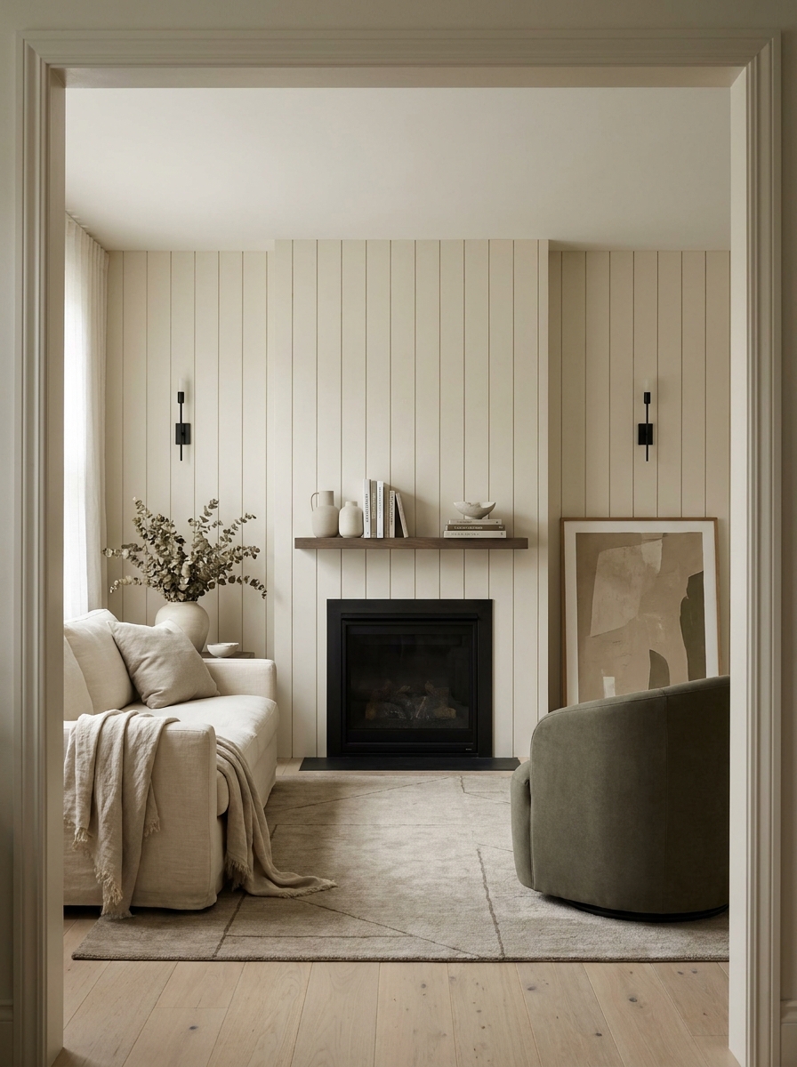
Sometimes a fireplace wall doesn’t need more stuff. It needs rhythm. Vertical paneling gives you that gentle structure that makes the whole wall feel intentional, even if the fireplace itself is very simple. It’s subtle, but in person it changes everything. The eye moves up, the room feels taller, and the fireplace instantly looks more integrated. I love this idea for newer homes where the walls can feel a little flat or builder-basic. A painted panel treatment around the fireplace adds polish without screaming for attention. Go tonal if you want it soft, like warm white on warm white, or choose a muddy greige for a little more mood. Either way, the lines create depth, which is often what these spaces are missing. This is also one of those updates that plays well with almost any style. Transitional, modern organic, even a slightly coastal room can handle it. Pair it with a simple mantel or none at all, then keep the styling clean. A piece of art, a pair of sconces, maybe one vase. Done. The wall itself becomes the feature, and it feels so much more custom.
Pro Tip: Keep panel spacing consistent across the entire wall, including above the mantel, so the treatment reads as one continuous design.
Create a Recessed Niche for Firewood and Decor
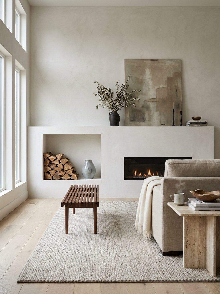
There is something so satisfying about a fireplace wall with a built-in niche. It feels custom. Thoughtful. A little designer-y, but still practical. And if you have a gas fireplace and don’t actually need wood nearby, you can still use that recessed space for stacked logs, candles, or sculptural objects that add texture without clutter. What I love most is the contrast it creates. A smooth wall with one tucked-in opening gives the eye somewhere to land. It’s especially pretty on plaster, stone, or painted drywall where you want a little depth but don’t want full shelving. You get that layered look without making the wall feel too busy. It’s one small move that makes the whole installation look more expensive. Try placing the niche off to one side instead of centering everything. That slight asymmetry can feel really modern and relaxed. Then style it simply. A few cut logs, one ceramic vessel, maybe a candle hurricane. That’s enough. The beauty is in the restraint here, and honestly, restraint can be the hardest thing to pull off. But when it works? So chic.
Pro Tip: Paint the inside of the niche one shade darker than the main wall to make the recess feel deeper and more intentional.
Float a Chunky Wood Mantel Across a Minimal Wall
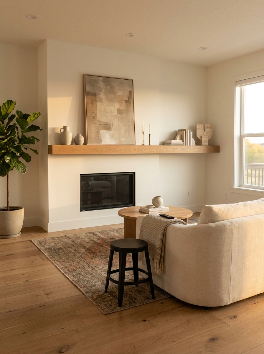
If you want warmth without a lot of visual noise, a chunky floating wood mantel is such a smart move. It gives the fireplace wall a natural anchor and just enough contrast to keep a plain wall from falling flat. And because it’s one strong horizontal line, it can make the whole setup feel calmer and more grounded. This works beautifully on painted drywall, plaster, or even a simple tiled surround. The trick is scale. A skinny mantel can disappear, especially on a larger wall. But one with a little heft? That feels deliberate. I love white oak for an airy room, walnut for something moodier, and reclaimed wood if you want a touch of rustic texture without going full farmhouse. Styling matters here too. Don’t crowd it with ten tiny objects. One large art piece leaning casually, a pair of candlesticks, maybe a ceramic vase with branches. That’s usually enough. You want the mantel to feel like part of the architecture, not a shelf at a craft fair. Keep it edited, and the whole wall feels stronger because of it.
Pro Tip: Aim for a mantel depth of at least 7 to 8 inches if you want it to hold larger art and still look substantial from across the room.
Frame the Fireplace With Matching Wall Sconces
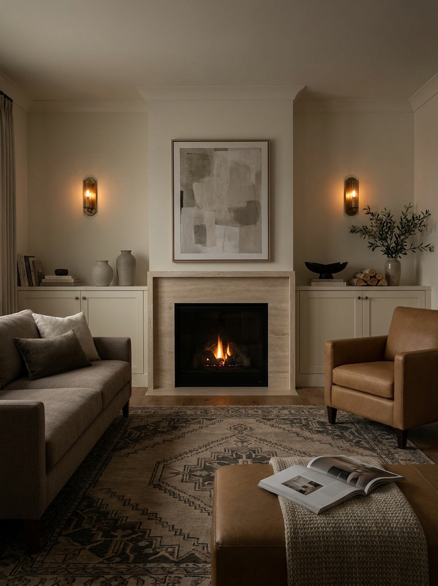
This one is small, but wow does it pull things together. A pair of sconces on either side of the fireplace gives the wall symmetry, glow, and that little bit of intention that makes a room feel finished. Even a very plain fireplace starts looking special when it’s framed by lighting. I love sconces because they do double duty. During the day, they add shape and a little jewelry to the wall. At night, they create this soft layered light that makes the whole living room feel cozier. And that matters more than people think. Fireplace walls are naturally emotional focal points. Lighting should support that, not fight it. The style you choose changes the mood right away. Slim black sconces feel crisp and modern. Aged brass feels warmer and a little more classic. White plaster sconces can disappear into the wall in the prettiest way. Just make sure the scale fits the wall and the spacing feels balanced around art, a TV, or a mantel. Tiny fixtures on a giant wall? Never quite right. Go a touch bigger than feels safe.
Pro Tip: Install sconces so their center point lands roughly 60 to 66 inches from the floor, then adjust slightly based on mantel height and what sits above it.
Blend the TV Into a Full Media Fireplace Wall
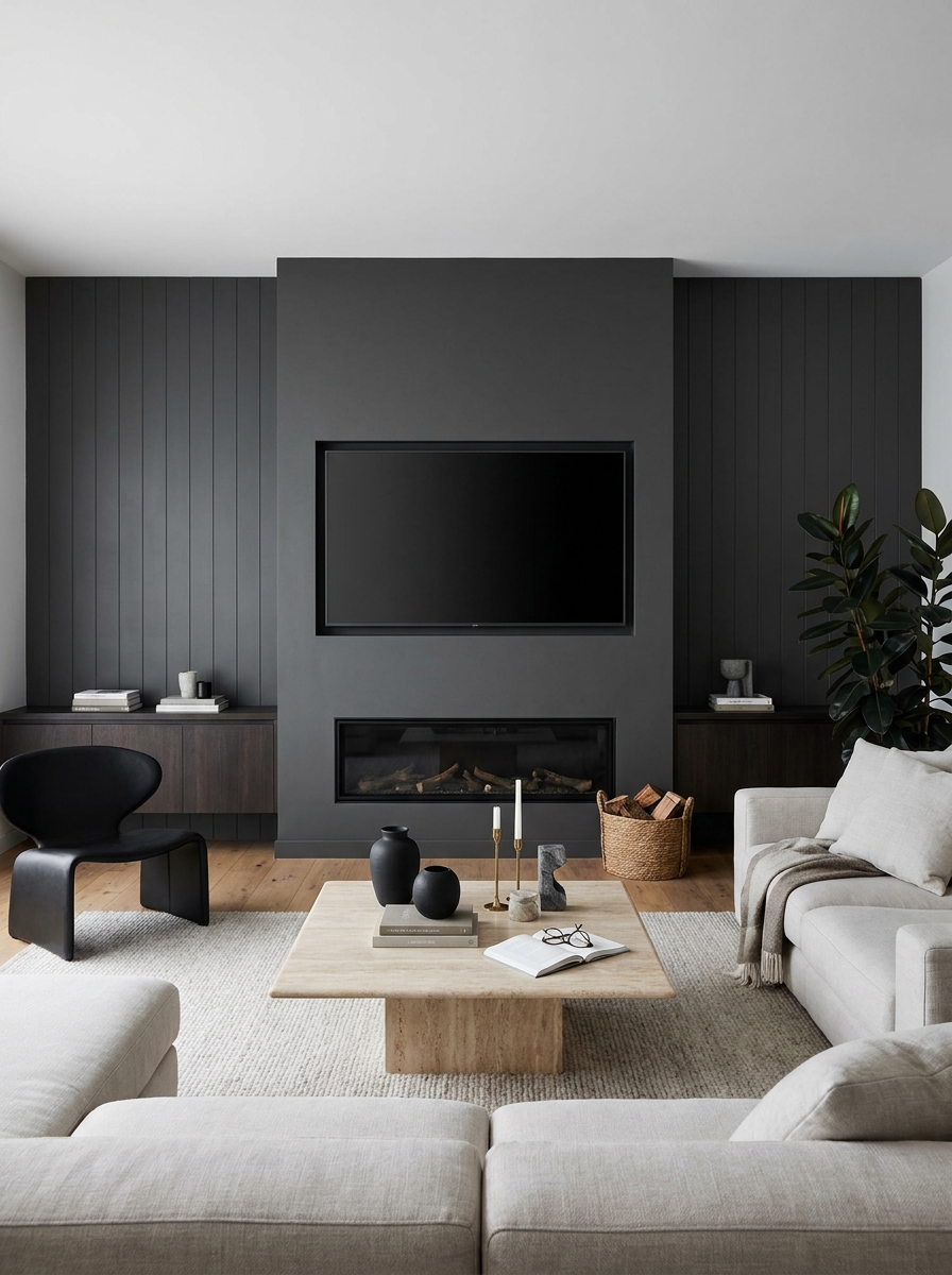
Let’s be honest. Most of us are not giving up the TV in the living room. So instead of pretending it isn’t there, make it part of the design. A good media fireplace wall treats the screen like one element in a larger composition, not the awkward black box hovering over everything. The easiest way to do that is with balance and material. Add paneling, plaster, stone, or built-ins around the fireplace so the TV feels integrated into something bigger. Keep the screen centered with the firebox if you like symmetry, or offset it within a shelving layout if your room needs more flexibility. And please, hide the cords. That one detail makes a shocking difference. I also think the styling around the TV matters more than the TV itself. A ledge below, shelves nearby, a darker wall color, or even a Frame-style screen can soften the whole setup. You want the eye to notice the wall first, not the electronics. Because this is still your living room, not a sports bar. Unless that’s your thing. No judgment, just maybe add a nice vase.
Pro Tip: Paint the wall behind the TV a mid-tone or darker shade so the screen blends in more naturally when it’s off.
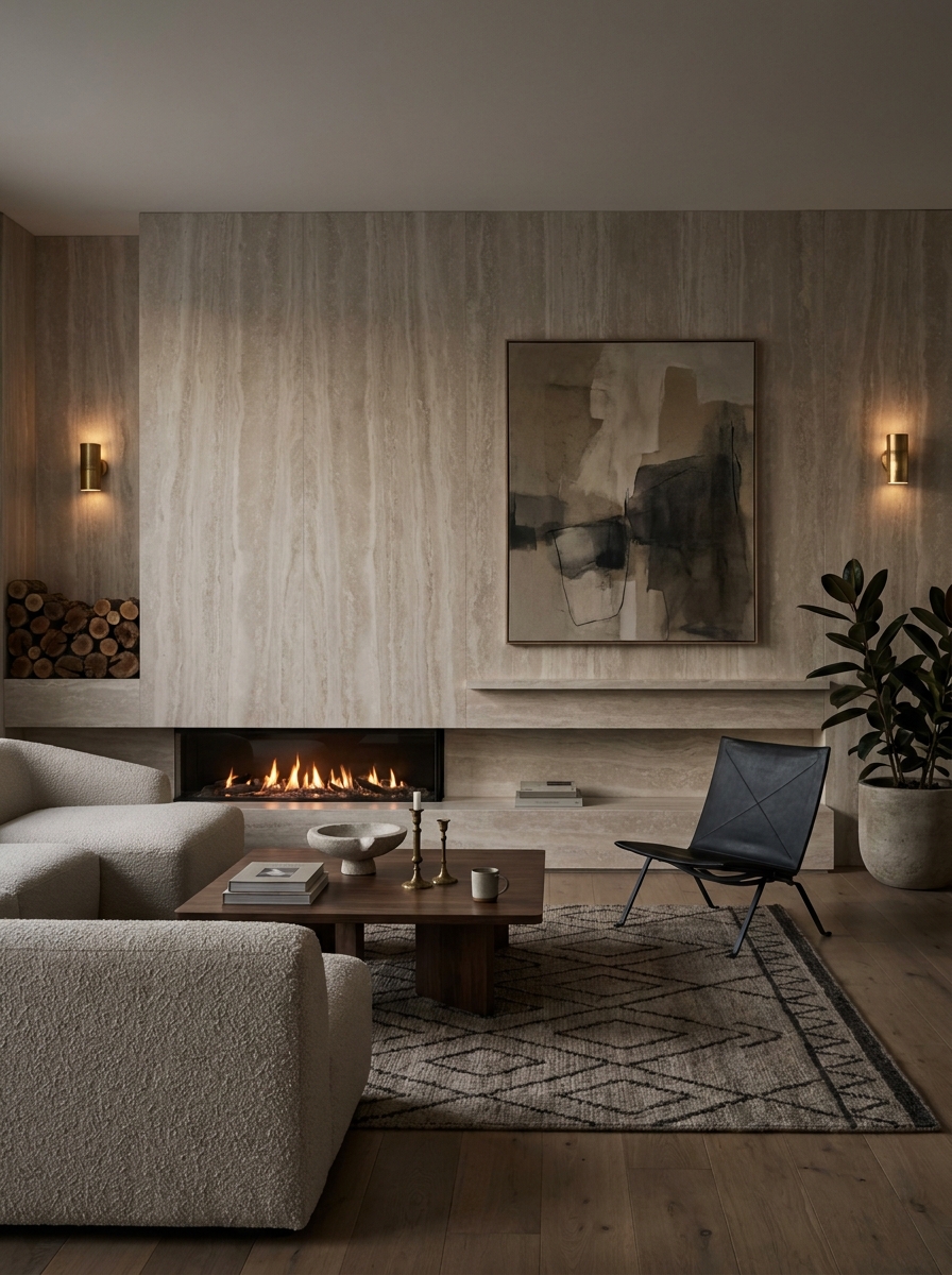
Layer Oversized Art Above a Low Linear Fireplace
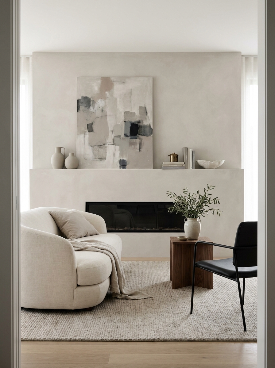
A low linear fireplace can sometimes feel a little too sleek on its own. Pretty, yes. But maybe also a bit cold or empty above. That’s where oversized art comes in. One large piece adds softness, personality, and a clear focal point without cluttering the wall with lots of smaller frames. I almost always prefer one bold canvas over a gallery wall here. The long fireplace already creates a strong horizontal line, so a single large artwork helps balance it without making things busy. Abstracts are great because they echo the colors in the room without getting too literal. Think warm neutrals, charcoal brushstrokes, earthy clay tones, maybe a hint of olive. Quiet, but not boring. Leaning the art on a ledge instead of hanging it can also make the whole fireplace wall feel more relaxed. Less precious. More layered. And that’s often what makes a room feel like a home instead of a staged photo. Add one or two objects nearby, then stop. The artwork should breathe. If you’re tempted to keep adding little pieces, step away slowly. The wall is probably done.
Pro Tip: Choose art that’s at least two-thirds the width of the fireplace opening so the proportions feel intentional and not skimpy.
Paint the Fireplace Wall a Contrasting Moody Neutral
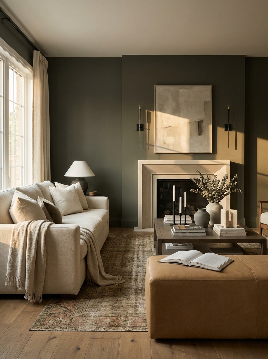
Sometimes the easiest way to make a fireplace wall matter is paint. Not bright paint. Not trendy-for-five-minutes paint. A moody neutral. Something with depth. Think olive gray, mushroom, charcoal brown, or that beautiful muddy taupe that changes all day long. It’s simple, affordable, and wildly effective. A darker fireplace wall creates contrast, which helps everything on it look sharper. The mantel stands out more. Art pops. A TV recedes better. Even the fire itself looks richer against a deeper backdrop. And if your living room is mostly light and airy, that one darker wall can keep the space from floating away into beige oblivion. You need a little weight sometimes. What makes this feel grown-up is staying in the neutral family instead of going high drama with a random color that doesn’t connect to anything else in the room. Pull the shade from your rug, sofa, wood tones, or stone accents so it feels rooted. Then repeat it once or twice in small ways around the room. That’s what makes the wall feel intentional instead of accidental.
Pro Tip: Use an eggshell or matte finish on a moody fireplace wall to keep the color rich while hiding minor wall imperfections.
Mix Closed Storage With Open Display for Balance
The prettiest fireplace walls usually aren’t fully open or fully hidden. They do both. Closed storage keeps the visual noise under control, while a few open sections let you add personality and shape. That mix is what makes the wall feel useful in real life and still nice to look at when toys, remotes, and mystery chargers are floating around. I really love this approach for busy homes because it gives you breathing room. You can hide the practical mess below and keep the eye-level areas curated. A couple of shelves with books turned both vertical and horizontal, one framed photo, a ceramic vase, maybe a little sculpture. That’s enough. The contrast between solid cabinet fronts and airy shelves gives the whole wall rhythm. And don’t underestimate how much cleaner a room feels when the fireplace wall isn’t trying to display every single thing you own. You want a little reveal and a little restraint. That’s the sweet spot. If your current setup feels chaotic, this layout can fix it fast without making the room feel stiff.
Pro Tip: Use closed cabinets for anything with cords, bright packaging, or kid clutter, and reserve open shelves for items in your room’s color palette.
Carry the Same Material Onto the Adjacent Wall
If you really want the fireplace wall to feel custom, let it spill a little. Carrying the same plaster, paneling, stone, or paint onto the adjacent wall makes the whole room feel more connected, like the fireplace was part of the original architecture instead of a one-off feature. It’s subtle, but it creates that designer flow people notice without knowing why. This works especially well in open-plan living rooms where the fireplace sits next to a dining area, hallway, or TV zone. Repeating the material even a few feet beyond the fireplace helps the eye travel naturally. It also stops that boxed-in effect where the fireplace wall looks like a decorated rectangle pasted onto the room. You don’t have to wrap the entire space, either. Even one side return can be enough. The trick is to keep the transition clean and intentional. And if you’re using a textured finish like limewash or plaster, the variation across two surfaces can look absolutely beautiful in changing light. It feels layered, calm, and a little bit fancy without trying too hard.
Pro Tip: Extend the fireplace wall finish at least 18 to 24 inches onto the adjacent wall so it reads as a design choice, not an accidental overlap.
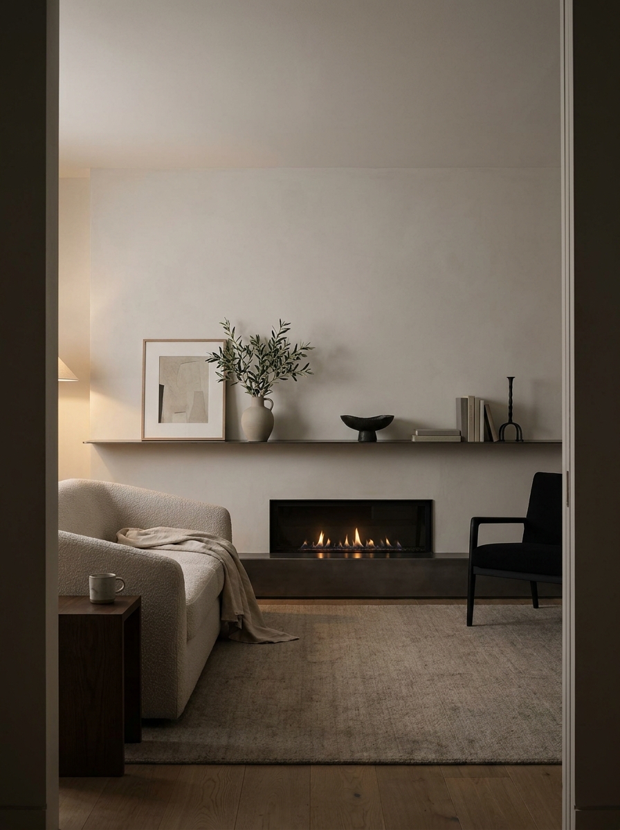
Add a Long Floating Ledge Instead of a Traditional Mantel
Not every fireplace wants a chunky mantel. Sometimes a long, slim floating ledge is the better move. It feels cleaner, more modern, and way less fussy, especially if your fireplace is linear or your room already has strong architectural lines. You still get a place to layer art and a few objects, but the wall stays light. I love this in homes where a traditional mantel would feel too formal or too bulky. A simple ledge in wood, stone, or painted drywall can run wider than the fireplace itself, which helps stretch the whole composition and make the wall feel more intentional. It also gives you freedom. You can lean art, move pieces around, and change the styling with the seasons without committing to anything precious. The key is editing. A ledge looks best when it isn’t crowded. One large frame, one vase, maybe a candle or sculptural object. That’s usually enough. Let the negative space do its thing. It feels relaxed and architectural at the same time, which is honestly a very good combo for a living room.
Pro Tip: Run the ledge 12 to 24 inches wider than the fireplace opening on each side for a more grounded, custom look.
Let One Sculptural Piece Be the Star
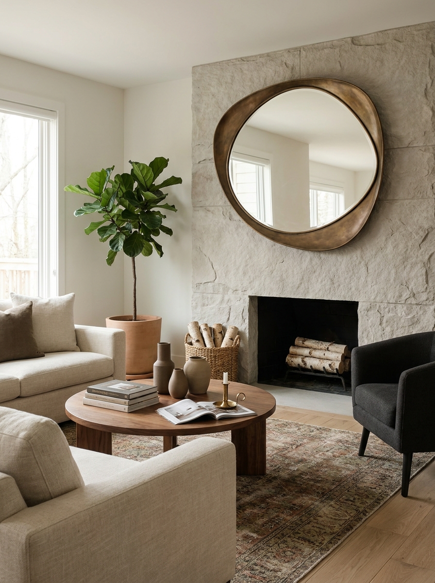
If your fireplace wall already has good bones, you may not need more layers. You may just need one unforgettable thing. A sculptural mirror, a bold abstract, a vintage stone relief, or even a dramatic pair of oversized vessels can give the wall that finished feeling without overcomplicating it. This is such a good reminder that not every design problem needs a built-in. Sometimes one strong statement brings the whole wall into focus. Especially if the wall has beautiful paneling, plaster, or stone already. In that case, the goal isn’t to cover it up. It’s to add one piece that creates tension and personality. I usually tell people to go larger than they first think. Tiny decor gets swallowed by a fireplace wall fast. One substantial sculptural element, though, can hold its own and make the room feel collected rather than decorated. And that’s the difference, isn’t it? Decorated can feel temporary. Collected feels like you. A little bolder. A little more relaxed. Much more memorable.
Pro Tip: Before buying, tape out the exact size of your sculptural piece on the wall so you can see whether it has enough presence from across the room.
Tile the Full Chimney Breast in a Pattern That Feels Collected
If your fireplace wall feels flat, patterned tile can wake the whole thing up fast. And I do not mean a tiny strip around the firebox. I mean taking the chimney breast all the way up so the fireplace reads like a real feature, not an afterthought. A soft geometric, a handmade checker, even a washed zellige look can add movement without making the room feel loud. It gives your eye somewhere to land the second you walk in. What I love most is how this idea can lean classic or modern depending on the tile. A faded star pattern feels a little old-world and layered. A clean stacked motif feels sharper and more current. Either way, the wall starts doing more decorating work for you. Suddenly the mantel can stay simple. The furniture can breathe. The whole room feels more finished because the fireplace wall has rhythm, texture, and a little personality built right in. This is especially pretty in rooms that need warmth but not more clutter. The pattern becomes the decor. Add one or two quiet accessories, let the tile carry the mood, and the fireplace wall instantly feels custom.
Pro Tip: Choose a tile pattern with at least one tone that matches your flooring or rug so the fireplace wall feels connected to the rest of the room.
Turn the Wall Into Millwork With Hidden Seam Details
Sometimes the most beautiful fireplace wall is not the one shouting for attention. It is the one quietly making the whole room look expensive. That is exactly what happens when you wrap the fireplace wall in tailored millwork with slim reveals, clean seams, and almost invisible panel lines. It feels architectural. Crisp. A little custom in that way people notice without always knowing why. The trick is to think beyond basic trim boxes. Go for full-wall millwork with long vertical or grid-like sections that frame the fireplace as part of the architecture. It gives the room order and polish, especially in a family room that needs to feel pulled together. I love this approach when you want detail but not visual noise. The wall still has depth, but it stays calm. This look also plays so well with different styles. In a transitional space, it feels tailored and timeless. In a newer home, it adds instant character that builders often skip. And because the detail is in the wall itself, you do not need to pile on decor. A few beautiful pieces, good lighting, and the fireplace wall suddenly looks like it came with the house in the best possible way.
Pro Tip: Ask your carpenter to keep panel reveals narrow and consistent, around half an inch, so the wall reads refined instead of busy.
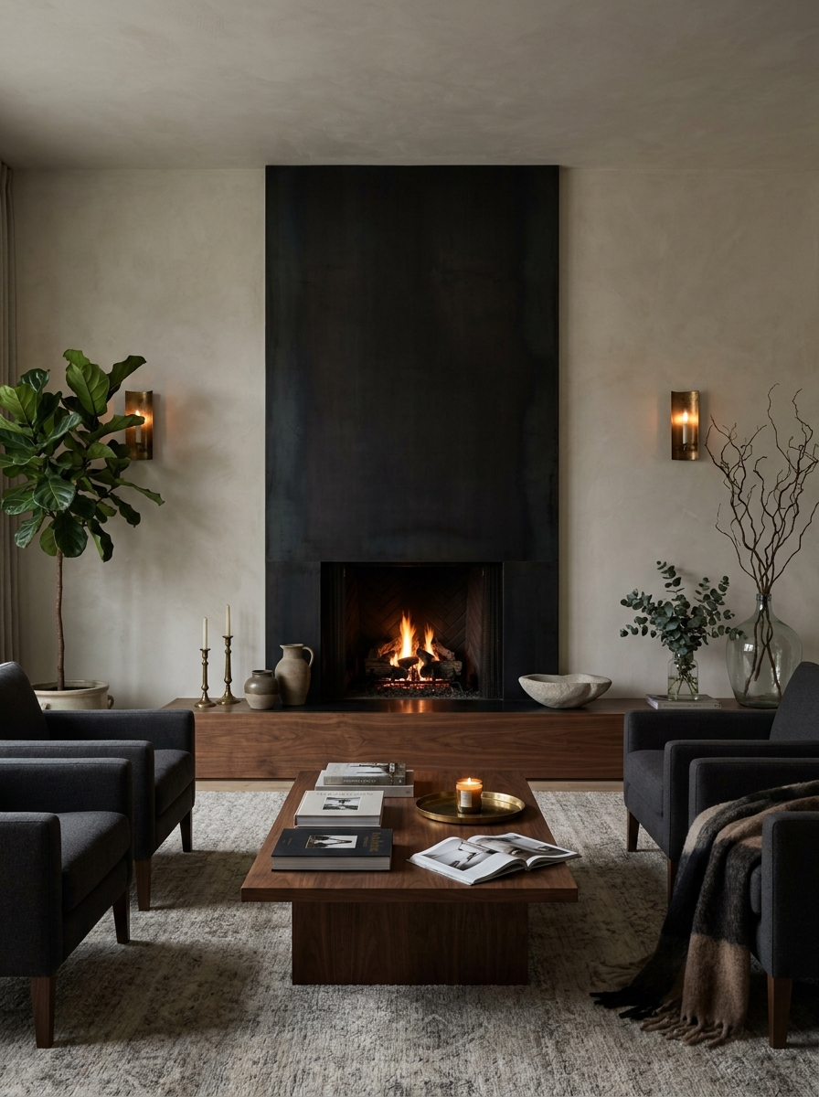
Use a Dark Metal Surround to Give the Wall a Sharp Architectural Edge
If you want the fireplace wall to feel cooler, cleaner, and a little more fashion-forward, dark metal is such a good move. A blackened steel or bronze-toned surround can stretch beyond the firebox and become a real wall feature. It adds definition in a way paint just cannot. The edges feel crisp. The contrast feels intentional. And the whole room gets that sleek architectural energy without losing warmth. I especially love this when the rest of the room is soft and tonal. Think pale walls, creamy upholstery, maybe a stone coffee table, and then this strong metal moment anchoring everything. It is the kind of contrast that makes a space feel designed. Not fussy. Just confident. You can keep the lines super minimal or add rivet details and folded edges for a more custom look. The best part is how beautifully metal changes with light. In the daytime, it looks graphic and sharp. At night, it turns moodier and richer, especially with firelight bouncing off the surface. If your fireplace wall needs structure more than decoration, this is one of those ideas that instantly gives it backbone.
Pro Tip: Extend the metal surround at least 12 to 18 inches beyond the firebox on all visible sides so it reads as a wall feature, not just a trim kit.
Build in a Fireplace Bench for Extra Seating and Softness
A bench around the fireplace wall changes the whole feel of the room. It makes the feature more inviting right away. Instead of the fireplace standing alone, the wall starts to feel integrated into how you actually live. A low built-in bench can stretch to one side, wrap the corner, or run across the base of the wall depending on your layout. It adds function, yes, but it also softens all that vertical fireplace drama in such a lovely way. This is one of my favorite ideas for family rooms and open-plan spaces because it creates a natural spot for people to gather. Add cushions, a throw, maybe a stack of books, and suddenly the fireplace wall feels cozy even when the fire is off. It also helps fill that awkward empty space beside a fireplace where people often shove a random chair and hope for the best. Design-wise, a bench can lean clean and modern or a little more tailored with upholstered pads. It gives the wall a horizontal layer, which is often exactly what tall fireplace features need. The result feels thoughtful, useful, and way more lived-in than a fireplace wall that only looks good from across the room.
Pro Tip: Keep the bench seat around 18 inches high and use performance fabric or washable cushion covers if it is in a busy family space.
Quick Guide
Quick Guide: Which fireplace wall update gives the biggest impact? Paint or moody neutral wall: $80–$250, best if your layout already works and you need contrast fast. Plaster or limewash finish: $300–$2,500 depending on DIY vs pro, best for soft texture and a quiet luxury look. Floating mantel or ledge: $150–$900, best for adding warmth without heavy construction. Built-ins: $1,500–$8,000+, best for storage, symmetry, and a custom feel. Floor-to-ceiling stone or slab: $2,000–$10,000+, best for dramatic architectural impact. Sconces and styling refresh: $150–$700, best if your wall feels flat but doesn’t need a full remodel. If you’re stuck, start with paint, lighting, and styling. Then build from there.
The Fireplace Wall Can Carry the Whole Room
A good fireplace wall doesn’t just warm the room. It steadies it. It gives your living room that finished feeling where everything else starts to make more sense. The sofa placement feels easier. The decor feels more intentional. Even the TV stops being so annoying. That’s why these kinds of updates matter. They change the mood of the whole space, not just one little section of it. And the nice thing is, you don’t have to do all 14 ideas or take on some huge renovation to get there. One change can be enough. Maybe it’s a darker paint color. Maybe it’s a long ledge, a pair of sconces, or finally adding the built-ins you’ve been pinning for months. Start with the version that fits your room, your budget, and your actual life. Your fireplace wall should feel like part of your home story, not a blank spot you’re constantly trying to ignore. So trust your eye, save the inspiration, and try one update. You might be surprised how quickly the whole room starts to click.
Frequently Asked Questions
How can I decorate a living room fireplace wall beyond just the hearth?
Think of the whole vertical wall, not only the firebox. Materials like plaster, paneling, stone, built-ins, art, and sconces help the fireplace feel like a full architectural feature. Even one simple move, like painting the wall a moody neutral or adding a long ledge, can make a big difference.
What is the best material for a modern living room fireplace feature wall?
It depends on the mood you want. Plaster and limewash feel soft and warm, while stone slabs feel more dramatic and architectural. If you want something budget-friendlier, painted paneling or a rich wall color can still look beautifully modern.
How do I make a TV over the fireplace wall look more stylish?
The trick is integration. Surround the TV with materials or millwork so it feels like one piece of a larger design, and hide cords whenever possible. A darker wall color, balanced shelves, or a Frame-style TV can also help the screen blend in instead of shouting at you.
Are built-ins around a fireplace worth it in a real family living room?
Honestly, yes, especially if you need storage. Lower cabinets hide the everyday mess, and open shelves let you add personality without cluttering every other surface. They also make the fireplace wall feel more custom and finished, which helps the whole room.
What color should I paint a fireplace wall in a neutral living room?
Look for a deeper neutral pulled from something already in the room, like your rug, sofa, wood tones, or stone. Olive gray, mushroom, muddy taupe, and soft charcoal all work beautifully because they add depth without feeling harsh. The goal is contrast that still feels connected.