
You know that feeling when you’re scrolling Pinterest and you see a front porch so stunning you actually gasp? The kind with perfectly symmetrical planters, gleaming door hardware, and that effortless “I just threw this together” vibe that clearly took hours to curate? That’s the energy we’re chasing here. Your front porch is literally the first thing people see. It sets the tone before anyone even rings the doorbell. And here’s the thing—creating that luxury magazine-cover look doesn’t mean you need a massive budget or a professional stylist. It’s about intentional choices, strategic symmetry, and knowing which details make the biggest impact. I’m sharing 14 luxury front porch styling ideas that’ll have your neighbors slowing down as they drive past. These aren’t complicated renovations or impossible Pinterest fantasies. They’re real, doable ideas that create that elevated, polished look we all want. Let’s get into it.
Oversized Black Lanterns for Instant Drama

Nothing says “I have my life together” quite like a pair of matching oversized lanterns flanking your front door. These aren’t your basic hardware store finds—I’m talking about statement pieces that stand at least 24 inches tall and command attention. Black is the power move here. It creates instant contrast against lighter doors and trim, and it photographs like a dream. The beauty of oversized lanterns is they fill vertical space without feeling cluttered. They draw the eye up toward your door and create that designer symmetry that screams luxury. Place them directly on your porch floor for a grounded, substantial look. Or elevate them on matching pedestals if you want extra height and drama. The key is keeping them proportional—your lanterns should be roughly one-third the height of your door. During the day they’re architectural sculptures. At night with candles or LED flames flickering inside? Pure magic. Pair them with a simple welcome mat and maybe one statement planter between them. That’s it. Sometimes the most luxurious looks are the ones that know when to stop.
Pro Tip: Choose lanterns with a matte black finish instead of glossy—it photographs better and looks more expensive and curated.
Layered Outdoor Rugs for Designer Depth

Here’s a trick straight from the pages of Architectural Digest—layer your outdoor rugs. Yes, really. It sounds extra, but it’s that exact kind of intentional layering that separates magazine-worthy porches from average ones. Start with a larger neutral base rug in jute or sisal. Then layer a smaller patterned rug on top—think geometric prints, classic stripes, or even a vintage-inspired Persian style in outdoor-friendly materials. This creates visual interest and makes your porch feel like an actual designed room, not just a transitional space. The layering adds dimension and helps define different zones if you have seating. It also solves the problem of sizing—sometimes one rug is too small and the next size up is too big. Two rugs together? Perfect. Plus it gives you flexibility to swap out the top layer seasonally without replacing your entire porch setup. Make sure both rugs are specifically rated for outdoor use. You want materials that can handle moisture, UV rays, and foot traffic without falling apart or fading after one summer.
Pro Tip: Angle your top layer rug slightly diagonal over the base rug for an effortlessly styled look that feels collected over time, not matchy-matchy.
Symmetrical Potted Topiaries for Timeless Elegance
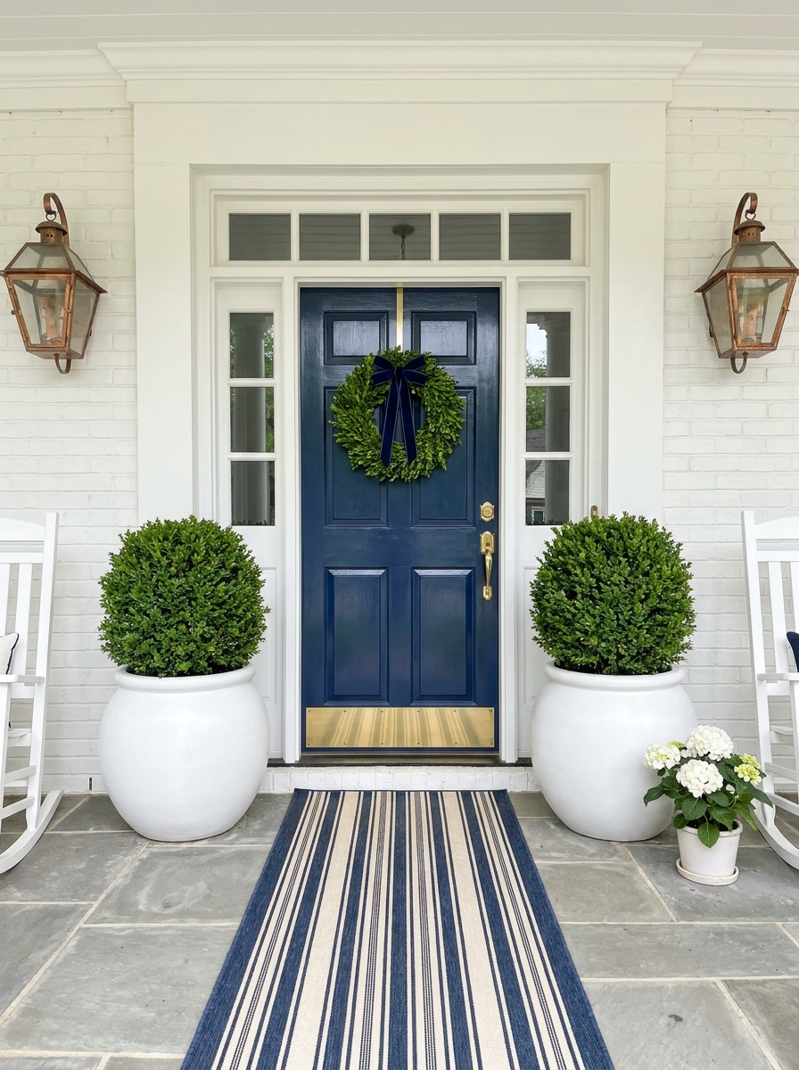
Want to know the fastest way to make your porch look like it belongs in a Charleston historic district? Matching potted topiaries. Boxwood, bay laurel, or even perfectly pruned olive trees in substantial planters create instant sophistication. Symmetry is non-negotiable here. Two matching planters, two matching plants, placed at equal distances from your door. This creates a sense of order and intentionality that our brains read as “expensive” and “well-maintained.” It’s the same principle fancy hotels use at their entrances. Choose planters that make a statement—oversized ceramic urns, modern concrete cylinders, or classic black metal containers. The planter matters almost as much as the plant itself. You want something substantial enough that it doesn’t look like you just grabbed whatever was on sale at the garden center. Real plants obviously look best, but high-quality faux topiaries have come so far. If you travel often or don’t have a green thumb, don’t feel guilty about going artificial. A realistic faux topiary that always looks perfect beats a dying real one every time.
Pro Tip: Add a 2-inch layer of decorative moss or river rocks on top of the soil in your planters—it hides the dirt and looks infinitely more polished and finished.
Statement Door Hardware That Commands Attention

Let’s talk about the jewelry of your front porch—the hardware. This is where you can make a massive impact without spending thousands or doing major construction. Swapping out basic builder-grade hardware for something substantial and beautiful is like putting on the right earrings. It completes the look. Go oversized. A door handle that’s too small looks cheap and apologetic. You want hardware that feels substantial in your hand and looks proportional to your door from the curb. Think about scale—if someone’s viewing your porch from 20 feet away, will that handle register as a design element or disappear? Finish matters enormously here. Brass (unlacquered or aged) brings warmth and works with nearly every exterior color. Matte black is modern and graphic. Oil-rubbed bronze feels traditional and rich. Polished nickel is clean and fresh. Just make sure you’re matching or coordinating with your other metal finishes like house numbers, mailbox, and lighting. Don’t forget the kick plate if your door can accommodate one. That horizontal band of metal at the bottom of the door is pure luxury signaling. It protects your door and looks incredibly high-end.
Pro Tip: Install a matching door knocker even if you have a doorbell—it adds vertical interest and that collected, estate-home feeling that elevates the entire entrance.
A Weathered Bench with Styled Cushions for Lived-In Luxury
Here’s the secret magazines know: a beautiful bench makes your porch look like someone actually lives there—and loves it. I’m talking about a substantial wooden bench or a pair of elegant chairs that say “sit, stay, relax.” But here’s where most people stop, and where you’re going to keep going. Layer it with outdoor cushions in a cohesive color story. Maybe crisp navy and white stripes with a geometric lumbar pillow. Or soft linen in greige with a subtle pattern. The key is making it look intentional but not fussy—like you just fluffed those pillows before your morning coffee. I love adding a small side table with a lantern or a stack of hardcover books wrapped in neutral covers. It’s those little “I actually use this space” touches that make a porch feel magazine-worthy instead of staged. Your visitors should want to sit down, not just admire from afar.
Pro Tip: Choose outdoor fabrics in colors that coordinate with your door and trim. Three pillows in varying sizes (one lumbar, two square) creates that designer-styled look without overcrowding your seating.
Fresh Seasonal Wreaths That Change with the Calendar

Want to know the easiest way to make your porch look like it’s been professionally styled? Change your wreath with the seasons. I’m not talking about those craft-store numbers with glitter and fake berries. I mean lush, full, expensive-looking wreaths that could’ve come from a florist. In spring, go for eucalyptus and white blooms. Summer calls for fresh greenery—magnolia leaves or olive branches. Fall is your moment for dramatic burgundy and copper tones, and winter needs real evergreen with subtle metallic touches. The wreath should be substantial—at least 24 inches—and hung at the perfect height with a beautiful ribbon or leather strap. This one switch makes your entire porch feel current and cared for. It’s like changing your throw pillows inside, but with way more curb appeal impact. People notice a beautiful wreath, even if they can’t pinpoint why your porch suddenly looks so much better than theirs.
Pro Tip: Invest in a high-quality wreath hook in a finish that matches your door hardware. A cheap hook ruins the whole look—trust me on this one.
Elevated House Numbers That Make Addresses Look Expensive

I cannot stress this enough: your house numbers matter more than you think. Cheap stick-on numbers from the hardware store scream “I didn’t think about this,” while beautiful, oversized numbers in the right finish whisper “every detail was considered.” Go big and go bold. I’m talking 6-8 inch numbers in a modern font, mounted with proper spacing. Matte black is always chic, brass adds warmth, and brushed nickel feels contemporary. Mount them directly on your door, beside it on the siding, or on a planter—just make sure they’re proportional and positioned at eye level. This is one of those tiny changes that photographs incredibly well and makes your whole porch look more polished. When I upgraded mine to oversized matte black numbers, three neighbors asked where I got them. It’s the detail people notice without realizing they’re noticing.
Pro Tip: Use a level and painter’s tape to mock up placement before drilling. Numbers should be centered and evenly spaced—measure twice, drill once. This isn’t the place for eyeballing it.
Coordinated Planters in Varying Heights for Visual Interest

Flat is boring. Magazine-worthy porches have dimension, and the fastest way to create it is with planters in different heights. I’m obsessed with the look of three or five planters grouped together—tall, medium, and low—all in the same material and color family. Think matching ceramic in glossy white, concrete in natural gray, or classic terracotta in oversized proportions. Fill them with a mix of textures: a tall ornamental grass, a round boxwood, and trailing ivy or sweet potato vine. The varying heights create movement and draw the eye up and around your entry instead of just across it. This is where a lot of DIYers go wrong—they pick random planters in different styles and wonder why it looks cluttered instead of curated. Cohesion is everything. Same finish, different sizes, planted with purpose. That’s the formula that gets your porch on Pinterest.
Pro Tip: Arrange planters in odd numbers (three or five works best) and group them asymmetrically on one side of your door for a more relaxed, editorial look that still feels intentional.
A Vintage-Inspired Mailbox Styled Like a Design Moment

Your mailbox shouldn’t be an afterthought—it’s one of the first things visitors see. A vintage-inspired mailbox mounted on a coordinated post or attached to your porch creates an instant designer detail that most people overlook. I’m obsessed with black metal mailboxes with brass accents or sleek modern designs that match your door hardware. Mount it on a post wrapped in the same stone or painted wood as your porch columns, then add a small planter at the base filled with seasonal blooms. It’s that finishing touch that makes everything feel intentional. The magic happens when your mailbox coordinates with your overall porch palette. If you’ve got black lanterns and hardware, echo that finish in your mailbox. Brass door knocker? Find a mailbox with brass details. This kind of thoughtful coordination is exactly what makes a porch look professionally designed instead of randomly assembled.
Pro Tip: Add a small house number plaque to your mailbox post that matches your front door numbers—it creates a cohesive visual thread that designers always use.
Architectural Corbels and Brackets That Add Custom Detail

Want to know a designer secret that instantly makes your porch look custom-built? Architectural corbels and decorative brackets. These little details add so much visual richness and make even a basic porch look like it was designed by an architect. I love adding corbels under porch columns or decorative brackets supporting overhead beams. They create shadow lines and depth that photographs beautifully and makes your entry feel substantial and high-end. You can find gorgeous options in wood, metal, or even weather-resistant composite materials. The key is choosing a style that matches your home’s architecture. Farmhouse porches look stunning with chunky wood corbels in a natural or painted finish. Traditional homes shine with ornate carved brackets. Modern designs work beautifully with sleek metal or minimalist geometric shapes. This one upgrade makes your porch look like it cost thousands more than it did.
Pro Tip: Paint corbels in a contrasting color from your porch ceiling—like black corbels against a white ceiling—to make them pop and add that designer edge.
A Styled Console Table or Shelf for Porch Personality

If your porch has even a small protected corner, a styled console table or floating shelf is pure magazine magic. It’s that unexpected layer that makes your porch feel like an actual outdoor room instead of just a pass-through space. I use a narrow weather-resistant console against the wall opposite my door, styled with a pretty lantern, a stack of faux books, and a seasonal arrangement. Or try a floating shelf next to your door holding a small potted plant and a decorative object. It’s these little vignettes that make designers swoon. The trick is treating it exactly like you’d style an entryway table inside—with height variation, a mix of textures, and items grouped in odd numbers. Keep everything weather-appropriate but don’t sacrifice style. This is where you can inject personality and make your porch feel uniquely yours while still looking incredibly polished.
Pro Tip: Use a tray on your console to corral smaller items—it keeps the look neat and makes it easy to bring everything inside during bad weather.
Curated Outdoor Lighting Layers for Evening Ambiance

Your porch needs to look just as stunning at night as it does during the day, and that means layering your lighting like a pro. Beyond your main porch light, adding multiple light sources creates that warm, inviting glow that screams luxury. I’m talking about combining your statement lanterns with subtle uplighting on plants, maybe string lights tucked under the eaves, or even LED strips hidden under railings. When you layer different light sources at different heights, you create depth and drama that makes your porch look like it belongs in a design magazine’s evening shot. The warmth of your light matters too. Skip the harsh white bulbs and choose warm-toned LEDs that make everything feel cozy and expensive. When your porch glows beautifully at dusk, it becomes the most photographable moment of the day—and the most welcoming sight for anyone coming home.
Pro Tip: Put all your porch lights on a smart dimmer or timer—you can control the ambiance from your phone and ensure your porch always looks its best, even when you’re not home.
A Painted Porch Ceiling in a Signature Hue for Designer Impact

Want to know the secret that separates a nice porch from a magazine-worthy one? Look up. A painted porch ceiling is the kind of detail that makes designers swoon and neighbors slow down as they drive past. Haint blue is the classic choice—that soft, dreamy blue-green that feels like a Southern tradition wrapped in elegance. But don’t stop there. Soft sage, warm greige, or even glossy black can transform your porch ceiling into a fifth wall that ties everything together. It’s an unexpected layer that adds depth and makes the whole space feel intentional and complete. This is one of those moves that photographs beautifully and feels luxurious in person. The color reflects down onto your face and furnishings, creating a cohesive glow that no amount of styling can replicate. It’s architectural jewelry—subtle but powerful.
Pro Tip: Choose a ceiling color that’s one shade deeper than your trim for a cohesive look, or go bold with a contrasting hue that picks up an accent color from your door or planters—it creates that designer-curated feeling instantly.
Oversized Decorative Urns as Sculptural Anchors

If your porch feels a little flat or forgettable, you’re probably missing a hero piece. Enter the oversized decorative urn—the kind of statement planter that looks like it belongs in a European courtyard or a designer’s estate garden. These aren’t your standard Home Depot planters. Think aged terracotta with a weathered patina, glossy black ceramic with clean lines, or concrete urns with classical detailing. They add height, drama, and a sense of permanence that smaller pots just can’t deliver. Place them on either side of your door or at the top of your porch steps, and suddenly your entry looks grounded and intentional. The beauty is in the scale. These urns command attention without trying too hard. Fill them with a single statement plant—a tall ornamental grass, a sculptural agave, or a lush seasonal arrangement—and let the urn do the talking. It’s effortless luxury.
Pro Tip: Choose urns that are at least 24 inches tall for real impact—anything smaller reads as average. Pair them with a single type of plant in each for a clean, editorial look rather than a busy mix.
Quick Guide
## Quick Style Guide: Matching Your Porch to Your Home **Modern Farmhouse:** Black lanterns + white planters + brass hardware + boxwood topiaries + striped rugs **Classic Traditional:** Symmetrical urns + brass everything + Persian-style rugs + formal wreaths + matching rockers **Contemporary Coastal:** Navy door + white trim + jute rugs + potted palms + nickel hardware + casual seating **Refined Southern:** Columns + ferns in elevated planters + copper lanterns + rocking chairs + layered rugs + magnolia wreaths **Budget Breakdown:** DIY Styling (under $300): New hardware, paint, planters, seasonal plants, outdoor rug Mid-Range Refresh ($300-800): Everything above plus statement lighting, quality furniture, multiple planters Luxury Transformation ($800+): Custom door, permanent architectural changes, designer furniture, built-in planters, professional landscaping
Your Front Porch Is Ready for Its Close-Up
Here’s what I love most about styling a luxury front porch—you see the results every single day. Not just when you have people over or when you’re entertaining. Every time you come home, you get that little hit of “I love my house” satisfaction. The magazine-worthy porch isn’t about perfection or spending a fortune. It’s about intentional choices. Symmetry over chaos. Quality over quantity. Details that make sense together. And honestly? It’s about caring enough to make your entrance feel special. You don’t need to implement all 14 of these ideas tomorrow. Start with one thing—maybe it’s new hardware, maybe it’s a pair of lanterns, maybe it’s finally getting those matching planters you’ve been eyeing. Small changes compound. Before you know it, you’ll be the house everyone slows down to admire. Your front porch is the opening line of your home’s story. Make it a good one. Make it feel like you. And definitely make it Instagram-worthy, because you’re going to want to document this glow-up.
Frequently Asked Questions
How do I style a small front porch to look luxurious without overcrowding it?
Focus on vertical elements instead of spreading things horizontally. Use tall flanking lanterns or planters to draw the eye up, and choose one statement piece rather than multiple small items. A beautiful door wreath, upgraded hardware, and a single high-quality doormat can create that luxury feel without taking up precious floor space. Remember that negative space is actually luxurious—don’t feel like you need to fill every inch.
What’s the best outdoor rug material that looks expensive but can handle weather?
Polypropylene rugs are your best friend for outdoor use. They’re UV-resistant, dry quickly, and can handle rain and sun without fading or getting moldy. Look for ones with a tight weave and geometric or traditional patterns—they photograph well and hide dirt better than solid colors. Brands like Boutique Rugs, Loloi, and even Target’s Threshold line offer outdoor rugs that look way more expensive than they are.
Should my front porch furniture match my door color or contrast with it?
Contrast usually creates more visual interest and that curated, designer look. If you have a dark door, lighter furniture (white rockers, natural wood benches) makes everything pop. With a white or light door, black or dark wood furniture adds sophistication. That said, tone-on-tone can work beautifully if you vary your textures—like a navy door with navy pillows but in different fabrics and patterns.
How often should I change my front porch decor to keep it looking fresh?
Your foundational elements—furniture, planters, lighting, hardware—should stay consistent. But swap your wreath, doormat, and seasonal plants four times a year with the seasons. This keeps your porch feeling current without requiring a complete overhaul. Spring gets fresh florals, summer brings lush greenery, fall introduces warm tones and texture, winter goes elegant and evergreen. Small seasonal touches make a big impact.
What’s the biggest mistake people make when styling a luxury front porch?
Going too small with everything. Undersized planters, tiny lanterns, a doormat that’s too small for the space—these make your porch look unfinished and cheap. Scale is everything in creating that luxury magazine look. When in doubt, size up. Your planters should be substantial, your lanterns should make a statement, and your wreath should fill at least two-thirds of your door’s width. Proportion creates impact.