
You know that moment when you step into your bathroom, look at the shower, and think, this whole room could be so much prettier? Not bigger. Not fancier in a weird hotel way. Just sharper, calmer, more pulled together. That’s usually where a shower tile remodel starts. One tired wall, one dated floor, one builder-grade niche, and suddenly you’re saving fifty screenshots before breakfast. The good news is you really don’t need a showroom-sized bathroom to make a serious impact. A smart tile choice can change the whole mood of the room. It can make a compact guest bath feel custom, give a primary suite that soft spa feeling, or add just enough drama to make the shower the star without taking over everything else. I pulled together 15 shower tile remodel ideas that feel fresh, elevated, and actually livable. Some are bold. Some are quiet. All of them can work in real homes with real budgets and real shampoo bottles. Here’s what actually works.
Large-Format Porcelain for a Clean, Seamless Look

If you want your bathroom to feel instantly calmer, start here. Large-format porcelain tile has that smooth, tailored look that makes even a basic shower feel more expensive. Fewer grout lines mean less visual fuss, which is wonderful in a space where your eye already has plenty going on with glass, hardware, and all the little daily products that somehow multiply overnight. And it’s not just pretty. It’s practical in a way I deeply respect. Bigger tiles usually mean easier cleaning, and that alone can sell the whole idea. Go for soft stone-look porcelain in warm beige, misty gray, or creamy white if you want a spa mood that still feels modern. If your bathroom is small, this kind of tile can visually stretch the walls and make the shower read as one polished surface instead of a choppy patchwork. Pair it with slim grout lines and simple fixtures so the tile gets its moment. A clear glass enclosure helps too. The whole effect is quiet but strong, like that friend who never tries too hard and still looks incredible. Sometimes the most dramatic move is actually the least busy one.
Pro Tip: Use a grout color that closely matches the tile so the large-format layout reads seamless instead of grid-heavy.
Vertical Stacked Subway Tile That Lifts the Ceiling
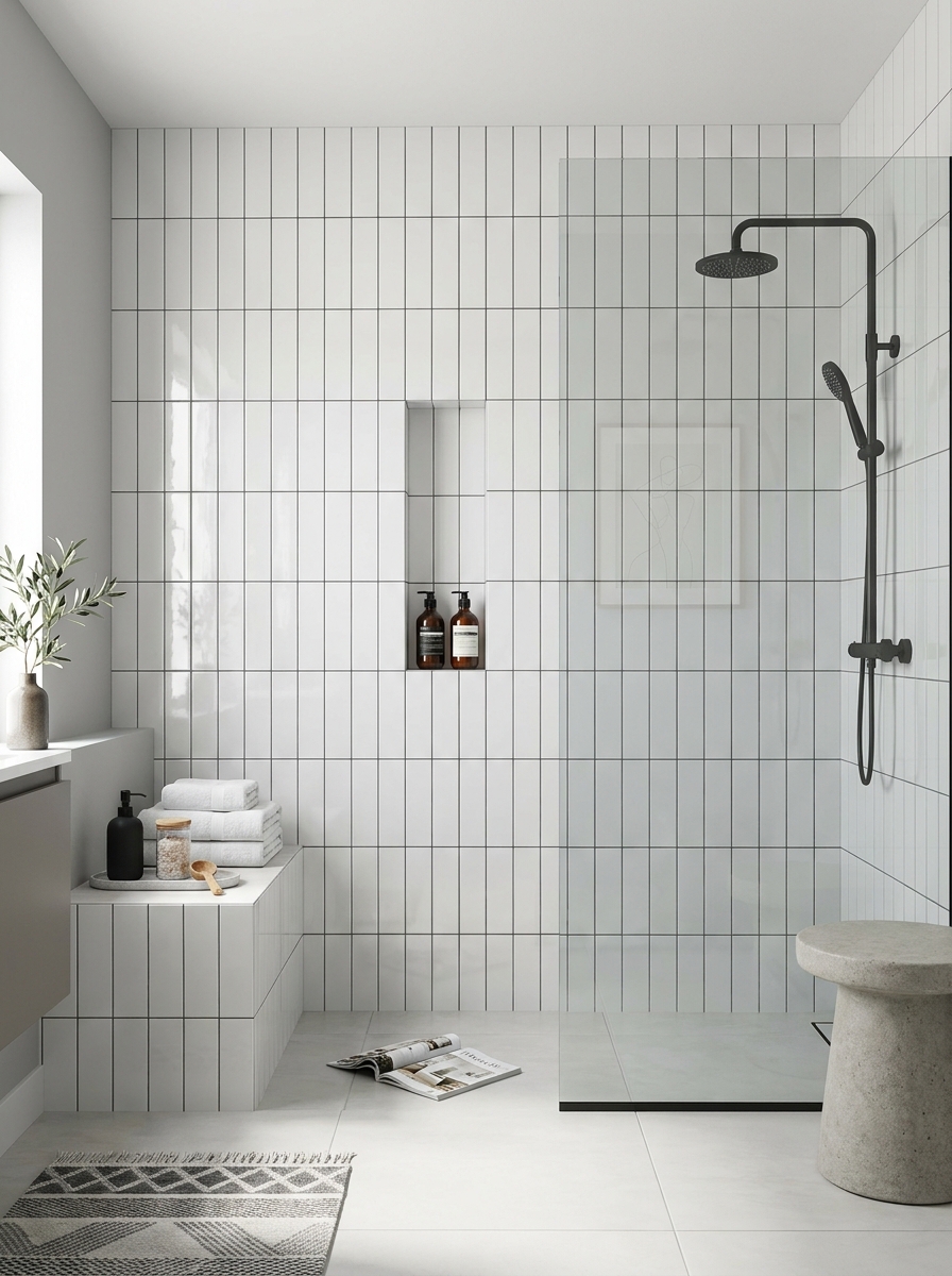
Subway tile is not boring. It just needs a better layout. A vertical stacked pattern feels crisp and current, and it does this lovely little trick where it draws your eye upward. That makes the shower feel taller, lighter, and more architectural without asking you to do anything wild. I especially love this look in smaller bathrooms that need a bit of visual height. Choose a glossy white, pale gray, or soft sage tile if you want brightness with a modern edge. The stacked layout keeps it from slipping into that classic kitchen-backsplash look. It feels cleaner, more intentional, and honestly a little fashion-forward. If you want more contrast, try dark grout. If you want the walls to feel airy, keep the grout close to the tile color. This style works beautifully with black, chrome, or brushed nickel fixtures, depending on the mood you want. Add a recessed niche lined in the same tile, and the whole shower suddenly looks custom. It’s one of those remodel choices that photographs beautifully but still feels easy to live with. Chic, simple, and not trying to be the loudest thing in the room.
Pro Tip: Run the tile all the way to the ceiling in a vertical stack to exaggerate height and make the shower feel custom-built.
Zellige Tile for Soft Shine and Handmade Texture

If flat, perfect tile leaves you cold, zellige might be your thing. It has that slightly uneven, light-catching surface that makes a shower feel layered and soulful instead of overly polished. Every tile reflects light a little differently, so the walls shimmer in this soft, relaxed way that feels expensive without feeling stiff. I love zellige most in colors that aren’t shouting. Think creamy white, sandy blush, muted sage, or pale gray-blue. The beauty is in the variation. It gives your bathroom movement, especially when sunlight hits it and the glaze starts doing its thing. And because the edges are a little imperfect, the whole space feels warmer and more collected. It’s modern, yes, but not cold. That balance is hard to get right. Keep the rest of the room edited so the tile can really sing. Pair it with simple hardware, clean glass, and maybe one stone or wood accent to ground all that shine. A zellige shower doesn’t need much else. It already has personality. It’s the bathroom version of effortless hair, which, frankly, we all know takes some planning.
Pro Tip: Order extra zellige and dry-lay a section first so you can blend color variation evenly before installation.
Marble-Look Herringbone for Instant Boutique-Hotel Energy

There’s something about herringbone that just makes a shower feel dressed up. Maybe it’s the movement. Maybe it’s the way it catches your eye without being chaotic. Either way, if you want a bathroom that feels polished and a little glamorous, marble-look herringbone is a very good idea. I like this best when the tile itself stays fairly calm. A white or pale gray marble-look porcelain with soft veining gives you that luxe feel without the maintenance drama of real marble. Then the herringbone layout adds the interest. It turns a simple material into a statement wall. In a walk-in shower, it can make the back wall feel like art. In a smaller alcove shower, it brings depth and makes the whole thing feel more intentional. Balance matters here. Let the pattern be the star and keep surrounding finishes streamlined. Think simple fixtures, a clear enclosure, and minimal clutter. If you want to push it one step further, repeat the tile inside the niche for a clean designer move. It’s elegant, but not fussy. And yes, it absolutely gives boutique hotel in the best way.
Pro Tip: Use herringbone on one main shower wall and a simpler coordinating tile on the side walls if you want impact without visual overload.
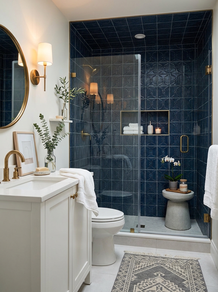
Moody Charcoal Tile with Brass for a Dramatic Glow

Not every bathroom needs to be bright and whispery. Sometimes the room wants a little drama. Charcoal shower tile brings that rich, cocooning feeling that can make a bathroom feel incredibly chic, especially when you warm it up with brass fixtures. It’s bold, but it doesn’t have to feel heavy. The trick is contrast. Deep charcoal walls look gorgeous with white ceilings, pale stone floors, or a light vanity nearby. That keeps the space from turning cave-like. And brass? Brass is the jewelry here. Against dark tile, it glows. Suddenly the shower feels tailored, moody, and expensive in a very grown-up way. I love this look in primary bathrooms, but it can also make a tiny powder-room shower feel wildly memorable. Use larger tile or a simple stacked layout so the color carries the drama, not a busy pattern. Add soft lighting and one or two natural elements like eucalyptus or a teak stool to keep it from feeling harsh. It’s not the safe choice, sure. But when it’s done well, this is the shower everyone talks about. The good kind of bathroom gossip.
Pro Tip: Choose a warm-toned grout with charcoal tile to soften the look and keep the shower from feeling too stark.
Soft Sage Tile That Feels Fresh but Not Trendy
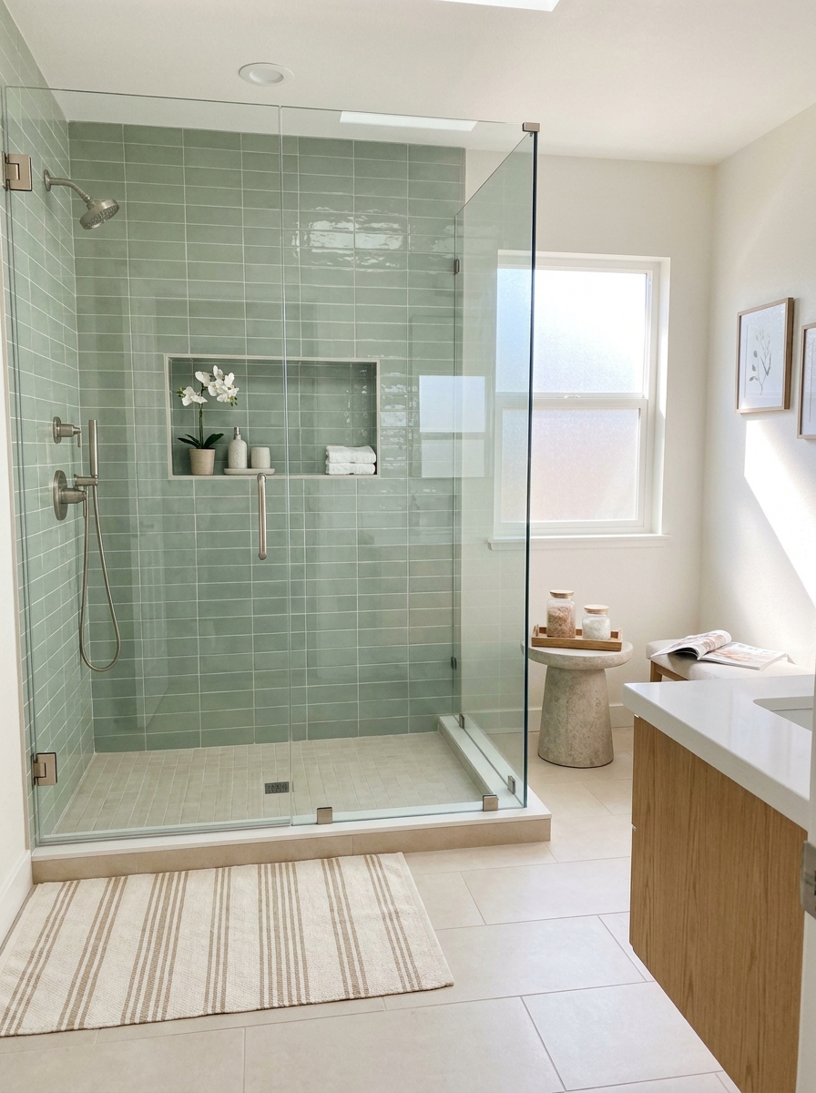
Sage green has been everywhere for a reason. It’s gentle, flattering, and somehow manages to feel both current and timeless. In a shower, soft sage tile brings color without shouting, which is ideal if you want personality but still need the bathroom to feel restful at the end of a long day. What I love most is how flexible it is. Pair sage with white for an airy spa vibe, with light oak for something warmer, or with black accents if you want a sharper modern edge. It looks especially pretty in elongated subway tile, square tile, or those slightly glossy handmade styles that catch light just enough. And unlike louder greens, sage doesn’t tire you out. It has staying power. This is also a lovely choice if your bathroom gets good natural light. The color shifts a little through the day, which makes the room feel alive in a subtle way. Keep the rest of the palette calm and let the green be the moment. It’s soft, yes, but definitely not sleepy. More like quietly confident. Which, honestly, is a very good vibe for a bathroom.
Pro Tip: Test sage tile next to your vanity wood tone before ordering, because undertones can swing cool or earthy fast.
Contrast Grout That Turns Simple Tile into a Feature
Sometimes the tile itself is pretty basic, and that’s completely fine. The magic can come from the grout. A contrast grout line can make even the simplest shower tile look graphic, custom, and way more interesting than its price tag suggests. It’s one of those little design moves that changes everything. White tile with dark grout is the classic example, but there are softer ways to do it too. Pale gray tile with charcoal grout. Warm ivory tile with taupe grout. Even navy tile with a lighter grout can look incredibly sharp. What you’re doing is outlining the pattern so the layout becomes part of the design. Suddenly stacked tile looks architectural. Brick lay feels punchier. Geometric shapes pop. This idea works best when the rest of the shower stays clean and intentional. You want the eye to notice those lines, not fight through clutter. So keep hardware simple, use a niche that aligns neatly with the tile grid, and be picky about installation. Crooked lines will absolutely ruin the mood here. But done right? It’s crisp, graphic, and surprisingly budget-smart. Proof that sometimes grout deserves a tiny standing ovation.
Pro Tip: Ask your installer for a grout sample board first, because grout dries lighter and can completely change the final look.
Mosaic Shower Floors with Calmer Walls

If you’ve ever fallen for a stunning tiny mosaic and then worried it might be too much on every wall, same. The sweet spot is using mosaic on the shower floor and keeping the walls quieter. That gives you texture, detail, and a little personality hit right where it counts, without making the whole shower feel visually busy. This combo works especially well in modern bathrooms because it balances function and style. Mosaic floor tile gives you great slip resistance, which is not glamorous but is very real-life useful. Then larger or simpler wall tile keeps the shower feeling open and clean. Penny tile, hex tile, or a soft geometric mosaic can all work beautifully depending on the mood you want. I love this approach when you’re trying to blend a statement with longevity. The floor gets to be the fun part. The walls stay easy to live with. And if you choose a mosaic color that ties into your fixtures or vanity, the whole bathroom feels considered instead of random. It’s a small move, but it adds that layered designer look people notice, even if they can’t quite explain why it feels so good.
Pro Tip: Choose a mosaic floor color that picks up one tone from your wall tile so the transition feels intentional, not choppy.
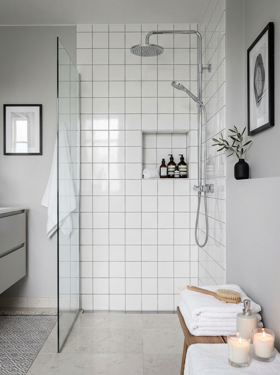
Niche Tile Accent That Adds a Small but Mighty Pop

A shower niche is one of those tiny spots that can do a lot of design work. If your main shower tile is calm, lining the niche with a contrasting tile gives the whole space a custom feel without requiring a full-on statement wall. It’s small, yes. But wow, it can wake up a shower fast. This is a great place to play with shape, color, or finish. Maybe your shower walls are soft white porcelain and the niche gets a glossy sage tile. Maybe the walls are warm beige and the niche gets marble mosaic. You can even use a bolder pattern here if the rest of the shower is quiet. Because it’s contained, it reads as a polished accent instead of visual chaos. I also love how this move makes a practical feature feel intentional. Shampoo storage isn’t glamorous, but a beautifully tiled niche kind of tricks you into thinking it is. Keep the products edited and the lines clean so the accent can stand out. It’s a small investment with a very designer payoff. Honestly, it’s one of my favorite ways to make a bathroom look more expensive without taking on a giant remodel.
Pro Tip: Frame the niche with a slim metal trim or mitered tile edge so the accent looks deliberate and finished from every angle.
Floor-to-Ceiling Tile for a Fully Finished Custom Feel

If you want your shower to feel truly remodeled, not just refreshed, taking the tile all the way to the ceiling makes a huge difference. It gives the space that built-in, intentional look that instantly reads more architectural. Even a simple tile becomes more impressive when it fully wraps the shower from top to bottom. This works especially well in bathrooms with standard-height ceilings, because it stretches the eye upward and makes the whole room feel taller. In a larger ensuite, it creates that luxe hotel feeling. In a compact shower alcove, it helps the space feel less chopped up. I love it with large-format tile, vertical stacked tile, or any quiet pattern that benefits from uninterrupted lines. And yes, it’s usually a little more material and labor. But visually, the payoff is big. The shower feels complete. Cleaner. More elevated. Pair it with a frameless glass panel and simple hardware so nothing interrupts the tile field. If your bathroom has beautiful lighting, even better. Full-height tile catches it in such a pretty way. It’s one of those choices that makes the room feel finished-finished, not almost done and waiting for one last decision.
Pro Tip: Ask your contractor to plan the tile layout from the ceiling line down so you avoid awkward skinny cuts at eye level.
Checkerboard Tile That Feels Graphic but Grown-Up
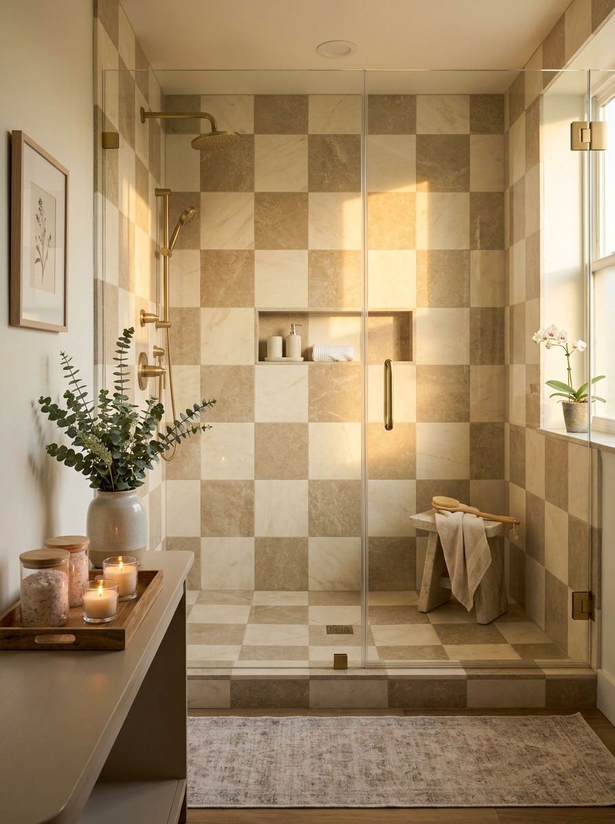
If you want your shower to have personality right away, checkerboard tile is such a fun move. But here’s the trick: keep it refined. Think soft stone tones, not loud diner vibes. A creamy ivory paired with warm taupe or pale gray can look incredibly polished, especially in a walk-in shower with clean glass and simple hardware. It gives the room movement, but still feels tailored. I especially love this look in bathrooms that need a little life. A basic shower alcove suddenly feels intentional. A compact guest bath starts looking like a designer touched every inch. The pattern pulls your eye in fast, which makes the shower feel like the star without needing ten other statement pieces. And if the rest of the bathroom is quiet, checkerboard tile brings just enough energy. What makes it work is scale and placement. Bigger squares feel calm and architectural. Smaller ones feel busier and more vintage. If you want that luxury modern balance, go medium to large and let the tile run across the main shower wall or continue onto the floor for a really confident finish. It’s playful, yes, but still very chic.
Pro Tip: Choose checkerboard tiles in low-contrast tones like ivory and taupe, then use a matching grout so the pattern feels elevated instead of overly busy.
Scalloped Tile for a Softer, More Playful Shower Statement

Sometimes a bathroom needs a little softness. Not sweetness. Not fuss. Just something that breaks up all the straight lines in a really pretty way. That’s where scalloped tile comes in. The curved shape adds rhythm to the shower wall, and suddenly the whole room feels more custom. It has that boutique feel, but with a lighter touch. I love scalloped tile in colors that stay calm and sophisticated. Think warm white, pale sand, dusty blue, or muted green. The shape already does a lot, so the color does not need to shout. In a shower alcove or even a small guest bath, it can make the space feel special without making it feel crowded. It catches light in the nicest way too, especially if the finish has a little sheen. This is one of those tile choices that feels fresh because of the silhouette, not because it is trying too hard. Paired with simple fixtures and quiet styling, it reads modern and a little whimsical in the best way. It turns a functional shower into something people actually remember. And honestly, that is half the fun of a remodel.
Pro Tip: Use scalloped tile on one main shower wall only, then keep the side walls simple so the curved pattern has room to shine.
Tone-on-Tone Tile Layers for Depth Without Visual Noise

If bold patterns are not your thing, but you still want your shower to feel designed, tone-on-tone tile layering is such a smart idea. This look is all about using similar shades in different shapes or finishes so the shower has depth without feeling busy. Maybe the walls are a soft greige rectangle tile, the back wall is the same color in a ribbed finish, and the floor shifts into a tiny matte mosaic. It is subtle, but so beautiful. This kind of tile story makes a bathroom feel expensive because it looks thoughtful. Nothing is random. Everything relates. And the effect is calm in that really satisfying, high-end way. You notice texture first, then shape, then the way the light moves across it all. It is quiet drama, which I personally never get tired of. I think this works especially well in primary bathrooms where you want the shower to feel spa-like but not plain. It gives you variation without adding more colors. And that means your stone counters, metal finishes, and wood vanity can all have their moment too. The whole room feels layered, not flat. It is one of those design moves that whispers, but still steals the show.
Pro Tip: Pick one undertone first—warm or cool—and make sure every tile variation stays in that same family so the layered look feels cohesive.
Deep Navy Tile with Pale Stone for a Crisp Tailored Look
There is something about navy in a bathroom that feels instantly polished. It is classic, but it still has edge. In a shower, deep navy tile can look incredibly sharp when you pair it with pale stone or bright white around it. The contrast feels clean and confident, almost like a perfectly tailored blazer in tile form. It is bold, but not flashy. I love this idea for people who want color without going too trendy. Navy has staying power. It works in modern spaces, transitional ones, even bathrooms with a little traditional detail mixed in. In a shower remodel, you can use navy on the back wall, wrap the full enclosure, or pair it with a lighter shower floor to keep things bright. Add aged brass or polished nickel, and it gets even better. What really sells this look is the balance. The richness of the navy makes the shower feel grounded, while pale stone keeps it fresh. It is dramatic in a neat, pulled-together way. Not moody, not beachy, not theme-y. Just elegant. If you want a shower that feels memorable the second you walk in, navy tile does that beautifully and without trying too hard.
Pro Tip: Test navy tile in both daylight and evening light before ordering, because some shades lean inky black while others read much brighter blue.
Mixed Finish Tile That Plays with Matte and Glossy Surfaces

One of my favorite ways to make a shower feel extra custom is to mix tile finishes instead of mixing colors. It is such a cool detail, and people always notice it even if they cannot quite figure out why the shower looks so good. A matte wall tile paired with a glossy version of the same shape or shade creates this soft, layered contrast that feels modern and a little unexpected. The beauty is in how the light hits it. Glossy pieces bounce light around and feel fresh. Matte pieces ground everything and keep it from looking slick. Together, they add movement without a loud pattern. You can alternate finishes in stripes, use gloss inside a niche, or create a panel effect on the back shower wall. Even a very simple tile shape suddenly feels elevated. This idea is perfect if you love a clean bathroom but still want that designer touch. It is subtle, but it never feels boring. In the right color, especially warm neutrals or smoky grays, the whole shower starts to feel rich and dimensional. It is one of those details that makes guests pause for a second and say, wait, what is going on here? And that is exactly the kind of magic a remodel needs.
Pro Tip: Order finish samples in the same color and place them side by side under your bathroom lighting before committing, because sheen can shift the shade more than you expect.
Quick Guide
Quick Guide: Which shower tile direction fits your bathroom? Large-format tile: Best if you want a clean, expensive look and easier upkeep. Vertical stacked subway: Great for smaller showers that need height. Zellige: Choose this if you love texture, softness, and a handmade feel. Herringbone marble-look: For a polished statement that still feels timeless. Charcoal tile: Perfect when you want mood and contrast. Sage tile: Lovely for a fresh spa vibe with a little color. Contrast grout: Budget-friendly way to make simple tile pop. Mosaic floor + calm walls: Smart if you want texture without visual overload. Accent niche tile: Ideal for a small custom detail. Floor-to-ceiling tile: Worth it when you want the shower to feel fully finished. The rest of the 15 ideas build on these same moods, just with different levels of boldness.
The Shower Can Absolutely Be the Pretty Part
A beautiful shower tile remodel changes more than the shower. It changes the whole feeling of the bathroom. Suddenly the room feels calmer in the morning, prettier at night, and way more like your space instead of the builder-basic version you’ve been tolerating for years. That’s the real magic here. And the best part? You don’t have to choose the loudest tile in the store to make an impact. Sometimes it’s the quiet large-format porcelain. Sometimes it’s a moody charcoal wall with brass. Sometimes it’s just a really good niche detail that makes everything feel more custom. Across all 15 ideas, the common thread is intention. The tile should work hard, look beautiful, and make daily life feel a little more elevated. So if you’ve been stuck between practical and pretty, take that as your sign to stop settling. You can have both. Save the ideas that made your heart do a tiny happy skip, compare samples in your actual light, and trust your eye. Your bathroom doesn’t need to be huge to steal the show. It just needs one smart, gorgeous move.
Frequently Asked Questions
What shower tile remodel ideas make a small bathroom look bigger?
Large-format tile, vertical stacked layouts, and floor-to-ceiling installation all help a small bathroom feel more open. They reduce visual breaks and pull the eye upward, which makes the shower feel taller and cleaner. Clear glass doors help too, because they let the tile stay visible.
Is porcelain tile better than ceramic for a shower remodel?
Porcelain is usually the stronger choice for showers because it’s denser and less porous than standard ceramic. That makes it especially good for wet areas and busy bathrooms. Ceramic can still work beautifully on shower walls, but porcelain tends to be the more durable long-term pick.
What is the most timeless shower tile pattern for a bathroom remodel?
Simple layouts tend to age the best, like stacked subway, classic brick lay, and large-format tile with minimal grout lines. Herringbone can also feel timeless if the tile color and veining stay soft and understated. The key is choosing a pattern that feels intentional, not overly trendy.
How do I choose shower tile that looks high-end but works in a real home?
Start with a tile that fits your lifestyle, not just your Pinterest board. Easy-to-clean surfaces, slip-resistant floors, and colors that work with your existing vanity and lighting matter just as much as looks. Then add one thoughtful detail, like a niche accent or a strong grout choice, to give it that designer finish.