
You walk into your kitchen and it feels… cramped. There’s a wall blocking your view of the living room, and you’re stuck cooking in isolation while everyone else hangs out just a few feet away. Sound familiar? Open concept kitchens aren’t just trendy — they’re game-changers for how we actually live. They make small homes feel bigger, let you cook while keeping an eye on the kids, and turn meal prep into a social event instead of solo work. But here’s the thing: knocking down a wall is just the start. The real magic happens when you design the space thoughtfully. From kitchen islands that do triple duty to lighting tricks that define zones without closing things off, there’s so much more to an open concept remodel than you might think. Whether you’re planning a full renovation or just dreaming about possibilities, these ideas will help you create a kitchen that flows beautifully with the rest of your home. Let’s get into it.
The Multi-Functional Island That Anchors Everything
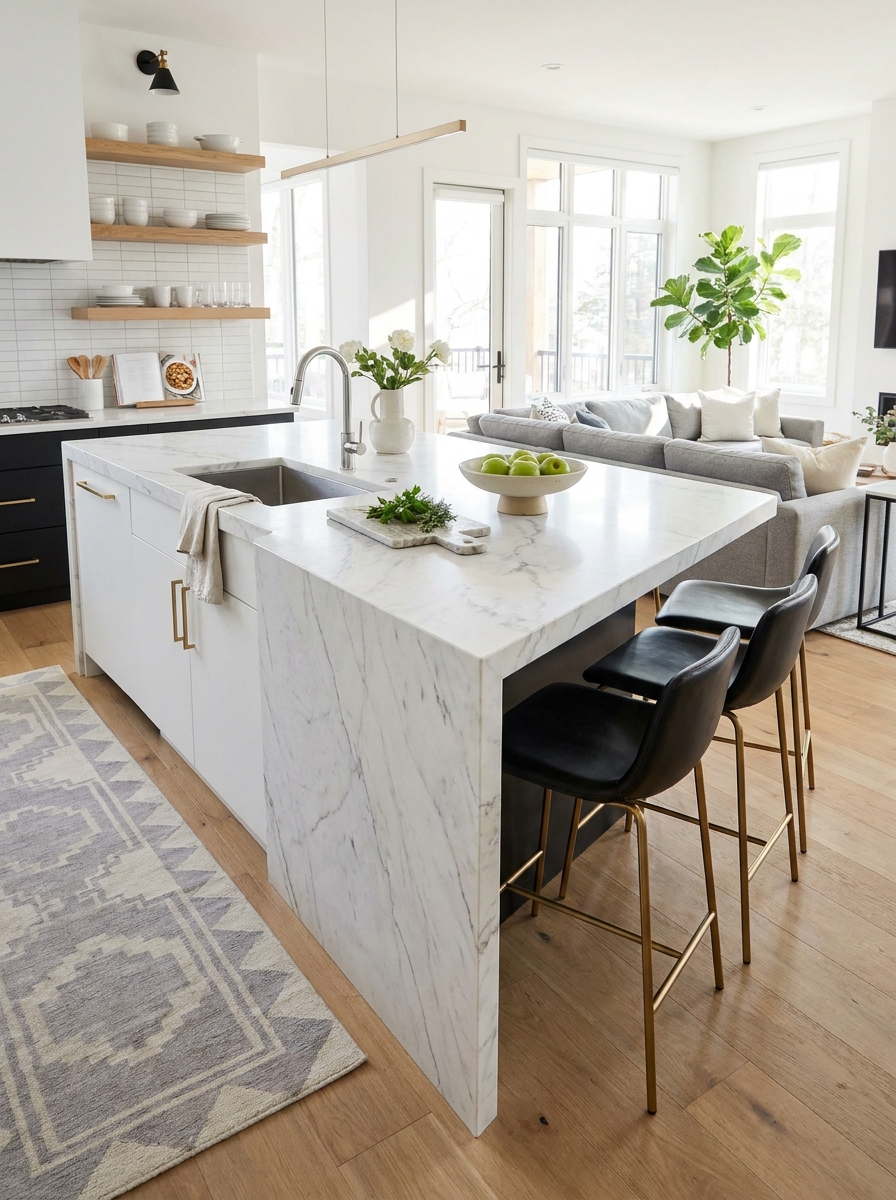
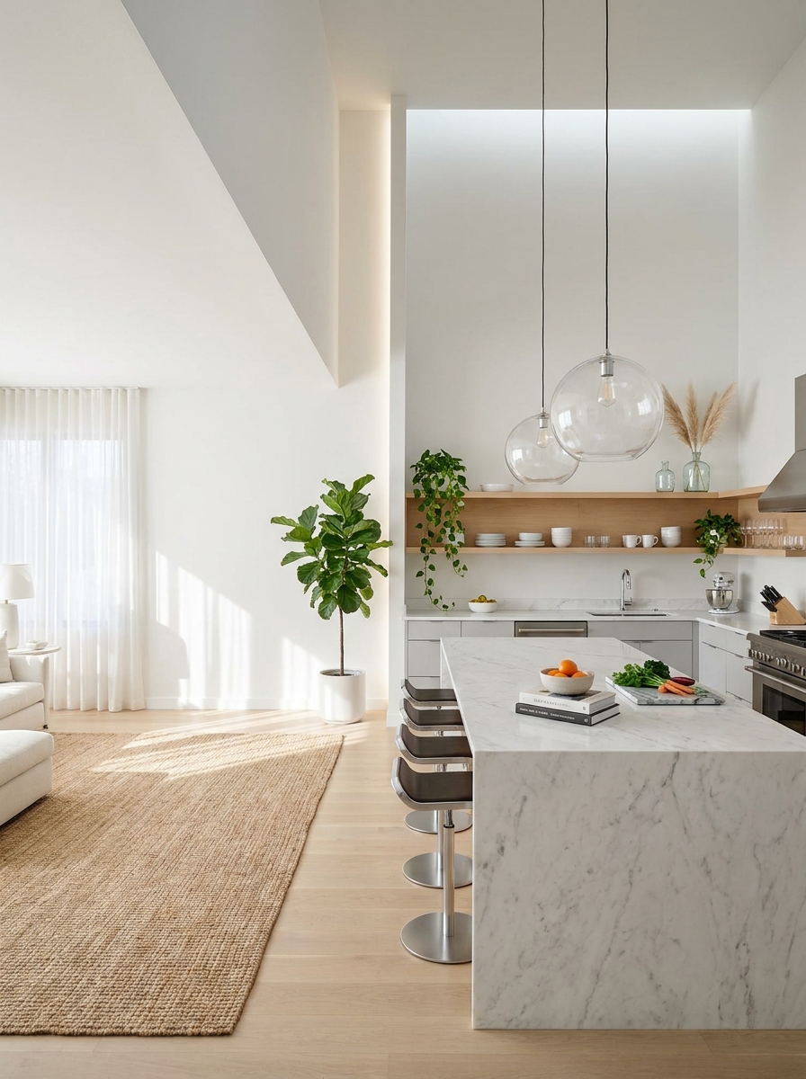
Your island isn’t just extra counter space — it’s the heart of your entire open concept layout. This is where cooking transitions into conversation, where breakfast happens on busy mornings, and where friends gather with wine while you’re prepping dinner. The best islands work on multiple levels. Think waterfall edges in marble or quartz that make a serious design statement. Add seating for at least three people on the living room side, with comfortable counter-height stools that actually invite people to sit. Include storage underneath — deep drawers for pots and pans, open shelving for cookbooks you actually use, maybe even a wine fridge if that’s your thing. And here’s what makes it brilliant: the island creates a natural boundary between your kitchen and living space without blocking sightlines. You get definition without division. The key is sizing it right — you need at least 42 inches of clearance on all sides for traffic flow, but in a spacious modern home, you can go bigger and create a true centerpiece that grounds the entire room.
Pro Tip: Install outlets on the end of your island (not the sides) so you can use small appliances without cords draping across the seating area — it keeps things looking clean.
Strategic Lighting Zones That Define Without Dividing

Lighting is your secret weapon for making an open concept kitchen feel cohesive yet clearly defined. You can’t rely on walls to separate spaces anymore, so light does that job instead. Start with statement pendants over your island — this is where you can have fun. Three oversized glass globes, a row of sleek black cylinders, or even a single linear fixture that spans the length of the island. These create a visual anchor and tell your eye “this is the kitchen zone” without needing a physical barrier. But don’t stop there. Layer in recessed lighting throughout the kitchen for task work, under-cabinet strips so you can actually see what you’re chopping, and then switch gears completely in the living area. Maybe it’s a sculptural floor lamp by the sofa or a different style of pendant over the dining table. The key is using different light sources at different heights to create distinct zones that still feel connected. When everything’s on dimmers, you can adjust the mood from bright and energizing during meal prep to soft and intimate for dinner parties.
Pro Tip: Put your island pendants on a separate dimmer switch from your recessed kitchen lights — you’ll use that flexibility constantly for different times of day and activities.
Floor Transitions That Create Flow Instead of Breaks
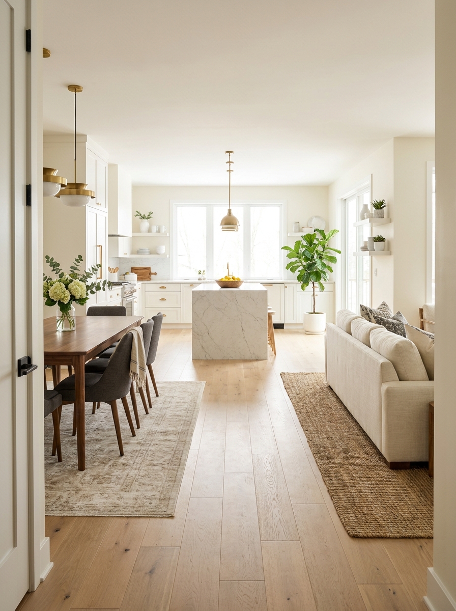
Here’s where a lot of open concept remodels go wrong: the flooring. You might think switching from tile in the kitchen to hardwood in the living room creates definition, but it actually chops up the space and makes everything feel smaller. Instead, run the same flooring throughout the entire open area. Light oak hardwood is gorgeous and timeless. Wide plank flooring in a soft gray-washed finish feels modern and spacious. Even large-format porcelain tiles that look like concrete can work beautifully if that’s your vibe. The continuous flow of one material pulls your eye across the entire space and makes it feel expansive. If you absolutely want some distinction, use area rugs strategically instead of changing the actual floor. A plush rug under the dining table, a low-pile runner along the kitchen workspace, a textured jute rug anchoring the living room seating area. Rugs are flexible, changeable, and they define zones without creating hard visual breaks. Plus you can swap them seasonally or when you get bored, which you definitely can’t do with flooring.
Pro Tip: Choose flooring in a light neutral tone — it reflects more light and makes the entire open space feel bigger and brighter than dark wood ever could.
The Glass-Front Upper Cabinets That Add Depth

Solid upper cabinets can make even a spacious kitchen feel heavy and closed-in, especially in an open concept layout where you want everything to feel airy. Glass-front cabinets change that completely. They add visual depth because your eye travels through the glass instead of stopping at a solid door. They make the kitchen feel lighter and more open while still providing storage. And they give you a chance to display the pretty stuff — your favorite white dinnerware, vintage glassware, or a collection of colorful ceramics that adds personality. You don’t have to do all glass. Try flanking your range or sink with glass uppers while keeping solid cabinets everywhere else. Or do a single wall of glass-front cabinets opposite your island to create a focal point. Just remember: what’s inside will be visible, so this works best if you’re willing to keep things relatively organized and styled. But honestly? That constraint makes you more intentional about what you keep, and your kitchen ends up feeling more curated and less cluttered anyway.
Pro Tip: Install interior cabinet lighting in your glass-front uppers — it creates a gorgeous glow in the evening and turns your dishes into a design feature instead of just storage.
Color Continuity That Pulls the Eye Through Space

Here’s something I learned the hard way: open concept doesn’t mean everything matches exactly, but your colors absolutely need to talk to each other. I’m obsessed with how a soft greige on the kitchen cabinets can echo in the living room throw pillows, creating this visual thread that makes the whole space feel intentional instead of chaotic. The trick is picking three main colors and letting them travel through your open space in different doses. Maybe it’s warm white walls everywhere, walnut wood that shows up in both your island base and your media console, and brass fixtures that appear in your kitchen hardware and living room lamp. Your eye follows these colors naturally, making the space feel cohesive without being boring. I love starting with the biggest elements first—cabinets, flooring, walls—then bringing those same tones into smaller accents. It’s like creating a color story that unfolds as you move through the space. The result? Everything feels connected and purposeful, even though you’re technically in different rooms.
Pro Tip: Paint a large sample board with your main wall color and move it around your space throughout the day—what looks perfect in morning light might feel too cool by evening, and you want a shade that works everywhere since it’ll flow through multiple zones.
The Lowered Ceiling Detail That Creates Intimacy

Okay, this might sound backwards in a space where you want openness, but hear me out. A slightly lowered ceiling section over your kitchen island or dining area actually makes your open concept feel MORE spacious. I know, wild, right? It’s because contrast creates drama—when you drop the ceiling in one spot, it makes the soaring height everywhere else feel even more impressive. I’ve seen this work magic in homes where the main ceiling is 10 or 12 feet high. By bringing down a section to 9 feet over the island with a subtle soffit or beam detail, you create this cozy zone that feels intimate for cooking and gathering, while the rest of the space still feels airy and open. It’s like having your cake and eating it too. The best part? That lowered section becomes the perfect spot to install statement lighting or architectural details that would get lost in a super high ceiling. It gives your eye somewhere specific to land without closing off the space.
Pro Tip: If you’re adding a lowered ceiling section, paint it the same color as your main ceiling—a contrasting color will make it feel heavy and boxed in, but matching tones keep the flow while still creating that subtle spatial definition.
Built-In Seating That Blurs the Kitchen Boundary

I’m completely smitten with built-in banquettes that wrap around from the kitchen into the dining area. There’s something so genius about seating that doesn’t technically belong to either space but serves both beautifully. It’s like the ultimate open concept move—creating a transition zone that makes you forget where the kitchen ends and the dining room begins. What I love most is how built-in seating adds architectural interest without taking up visual space the way freestanding furniture does. A sleek L-shaped banquette with storage underneath feels intentional and custom, especially when you upholster it in a durable fabric that can handle both breakfast spills and dinner parties. Add a floating table and you’ve got this incredibly functional spot that feels way more special than just pulling chairs up to a counter. The secret is keeping the design clean and low-profile. We’re not talking about bulky booth seating here—think slim cushions, straight lines, and maybe some hidden storage that makes the whole thing earn its keep in your open layout.
Pro Tip: Install your built-in banquette at exactly 18 inches high—any lower feels awkward, any higher and it starts blocking sightlines across your open space, which defeats the whole purpose of keeping things visually connected.
The Appliance Garage That Keeps Counters Zen

Can we talk about counter clutter for a second? Because in an open concept kitchen, every single thing on your counter is on display to your entire living space. That’s where appliance garages become absolute lifesavers. I’m talking about those clever cabinet sections with retractable doors that hide your toaster, coffee maker, and blender when you’re not using them. The magic happens when you design these garages right into your cabinetry plan from the start. A pocket door that slides up or a tambour door that rolls back means your appliances are still totally accessible, but they disappear when you want that clean, minimalist look. I’ve seen people create entire coffee stations inside these garages, complete with outlets and pull-out shelves—it’s like a secret productivity zone. In an open layout where your kitchen is always visible, these hidden storage solutions make such a difference. Your space looks pulled-together and intentional, not like you’re living in a permanent state of breakfast prep. And honestly? That visual calm makes the whole space feel bigger.
Pro Tip: Install outlets inside your appliance garage on the back wall, not the side—it keeps cords from creating weird angles and lets you slide doors closed even when things are plugged in, which is a total game-changer for daily coffee routines.
The Floating Shelves That Replace Upper Wall Cabinets

Here’s a game-changer I wish I’d known earlier: ditching upper cabinets on one wall and going with floating shelves instead. It sounds scary at first—where will everything go?—but the visual payoff is incredible. Your kitchen instantly feels twice as big because you’re not blocking sightlines with bulky cabinet boxes. I love how open shelves force you to be intentional about what you display. Suddenly you’re curating instead of cramming. Stack your prettiest dishes, line up matching canisters, add a trailing plant or two. It becomes part of the decor, not hidden behind closed doors. The trick is keeping it edited. You don’t need shelves on every wall—just one strategic section facing your living area. This creates that magazine-worthy open feel while your closed cabinets on other walls handle the less-pretty stuff. It’s the perfect balance of function and that airy, expansive vibe we’re after.
Pro Tip: Install shelves at varying depths—shallow ones up high for decor, deeper ones at eye level for everyday dishes. This creates visual interest and makes the whole setup feel custom and intentional.
The Consistent Backsplash That Travels Beyond the Kitchen
Want to know a sneaky trick that makes your open concept feel ridiculously cohesive? Extend your kitchen backsplash material into the adjacent spaces. I’m talking about carrying that same tile or stone onto a fireplace surround, an accent wall behind your dining table, or even a bar area. This creates what designers call visual rhythm—your eye follows that repeating material and suddenly everything feels connected and intentional. It’s like the spaces are having a conversation with each other instead of shouting different ideas. I’ve seen this work beautifully with everything from subway tile to slab marble. The key is choosing something you genuinely love because you’ll be seeing a lot more of it. But that’s actually the point—when you repeat a quality material, it elevates the entire space. It stops feeling like “kitchen tile” and starts feeling like a deliberate design choice that unifies your whole first floor.
Pro Tip: Use the backsplash material in smaller doses outside the kitchen—like a 4-foot accent section—rather than covering entire walls. This creates connection without overwhelming the space or breaking your budget.
The Pocket Door That Disappears When You Don’t Need It

Okay, this one’s for anyone who loves open concept but occasionally needs privacy or noise control. Pocket doors are absolute magic in these spaces. When you want openness, they slide completely into the wall and vanish. When you need to hide kitchen cleanup during a dinner party or contain cooking smells, boom—instant wall. I’m obsessed with the flexibility this gives you. It’s like having your cake and eating it too. You get all the benefits of open living without committing 100% to never having separation again. Some people install them between kitchen and living room, others use them to section off a pantry or prep zone. The modern versions are so sleek now—none of that hollow door rattling from the ’90s. We’re talking smooth-gliding barn door hardware or completely concealed tracks. They become part of the architecture, not an afterthought. And honestly? Just knowing you have the option to close off a space makes open concept feel less risky.
Pro Tip: Install a soft-close mechanism on your pocket door—it prevents slamming and makes the whole thing feel expensive and well-built, plus it’s gentler on the wall pocket over time.
The Stepped Ceiling Height That Creates Drama Without Walls
This is one of those architectural moves that makes people stop and say “wow” without even knowing why. Instead of a flat ceiling throughout your open space, you raise the kitchen ceiling higher than the adjacent living area—or vice versa. It creates distinct zones purely through vertical space, no walls required. I’ve seen this work incredibly well in homes with vaulted ceilings or even standard 9-foot heights. The step doesn’t need to be dramatic—even a 12-inch difference reads as intentional and creates that subtle separation our brains crave. It’s especially effective when you add recessed lighting or a statement fixture at the height transition. The beauty is how it plays with scale and proportion. A higher ceiling over your kitchen makes the space feel grand and chef-worthy, while a slightly lower ceiling in the living area creates that cozy, intimate vibe for relaxing. You’re literally using air and light to define spaces instead of drywall. It’s architectural poetry, honestly.
Pro Tip: Paint the higher ceiling section a shade lighter than the lower one—even if it’s subtle. This amplifies the height difference and draws the eye upward, making your kitchen feel even more expansive.
The Furniture-Style Range Hood That Looks Like Decor

Here’s the thing about range hoods in open concept kitchens — they’re usually these massive stainless steel monsters that scream “KITCHEN!” from every angle of your home. But what if your hood looked more like a gorgeous architectural feature than an appliance? I’m obsessed with furniture-style range hoods right now. Think wood-wrapped hoods that match your island, plaster hoods that blend seamlessly with white walls, or even brass-clad statement pieces that feel more like sculpture than ventilation. When your range hood becomes a beautiful focal point instead of something you’re trying to hide, it actually enhances the open concept instead of fighting against it. The magic is in choosing materials that echo what’s happening in your living spaces. A reclaimed wood hood brings warmth that connects to your dining table. A smooth plaster hood creates continuity with your living room walls. Suddenly your kitchen doesn’t feel like a separate zone — it feels like one cohesive, beautifully designed space where even the functional stuff looks intentional.
Pro Tip: If you’re going custom, make your hood slightly wider than your range (about 3-6 inches on each side) so it feels substantial and intentional, not like an afterthought stuck to the wall.
Quick Guide
**Quick Budget Guide: What To Expect** | Remodel Element | Budget Range | Worth The Splurge? | |—|—|—| | Removing load-bearing wall | $1,200–$3,000 | Yes — it’s the foundation | | Kitchen island with seating | $2,000–$8,000 | Yes — it’s your centerpiece | | Quartz countertops | $50–$100/sq ft | Yes — durability + beauty | | Pendant lighting | $150–$600 each | Mix high and low | | Hardwood flooring | $8–$15/sq ft installed | Yes — continuous flow matters | | Glass-front cabinets | $200–$400/cabinet | Do selectively for impact | **Money-Saving Tip:** Keep your plumbing in the same location if possible. Moving your sink or dishwasher adds $1,000+ to your budget instantly. Work with your existing layout and invest those savings in statement lighting or better countertops instead.
Your Kitchen, But Make It Breathe
Here’s what I love most about open concept kitchens: they’re not just about aesthetics. They’re about how you actually want to live. You want to cook dinner without missing the conversation happening three feet away. You want your home to feel bigger and brighter without adding square footage. You want spaces that flow naturally instead of boxing you into separate rooms. The thirteen ideas we covered aren’t just design tricks — they’re about creating a kitchen that works with your real life. Maybe you start with better lighting. Maybe you save up for that dream island. Or maybe you’re planning a full remodel and now you’ve got a clear vision of what you actually want. Whatever your timeline looks like, remember this: the best open concept kitchens feel spacious but still cozy, modern but not cold, designed but genuinely livable. Start with one element that excites you most and build from there. Your kitchen’s waiting to breathe a little.
Frequently Asked Questions
How much does it cost to remodel a kitchen into an open concept layout?
A basic open concept kitchen remodel typically runs $15,000–$40,000, depending on whether you’re removing walls, relocating plumbing, or doing a full renovation. Removing a non-load-bearing wall might cost $500–$1,500, while a load-bearing wall removal with structural support runs $1,200–$3,000. The biggest expenses are usually the kitchen island, countertops, and flooring throughout the open space.
What’s the best flooring for an open concept kitchen and living room?
Run the same flooring throughout the entire open space for maximum flow and spaciousness. Light oak or gray-washed wide-plank hardwood is gorgeous and timeless. If you need something more durable in the kitchen zone, large-format porcelain tile that mimics wood or concrete works beautifully. Avoid switching materials between rooms — it chops up the space visually.
How do you define spaces in an open concept kitchen without walls?
Use your kitchen island as a natural boundary, different lighting fixtures to create zones (pendants over the island, floor lamps in the living area), and area rugs to anchor distinct spaces. Changing ceiling heights with a coffered ceiling or subtle bulkhead can also define the kitchen zone. The key is creating definition through design elements instead of physical barriers.
What size should a kitchen island be in an open concept layout?
Plan for at least 4 feet long and 2 feet deep as a minimum, but in a spacious open concept home, you can go bigger — 8 to 10 feet long works beautifully. Make sure you have 42–48 inches of clearance on all sides for comfortable traffic flow. Include seating for at least three people if you want it to function as a gathering spot.
How do you keep an open concept kitchen from looking cluttered?
Embrace closed storage for everyday clutter, use glass-front cabinets only for items you want displayed, and keep countertops as clear as possible. A large island with hidden storage helps enormously. Consistent color palette throughout the open space (whites, grays, natural wood) also makes everything feel calmer and more cohesive even when life gets messy.